

US Cities by Traffic Congestion, 2026
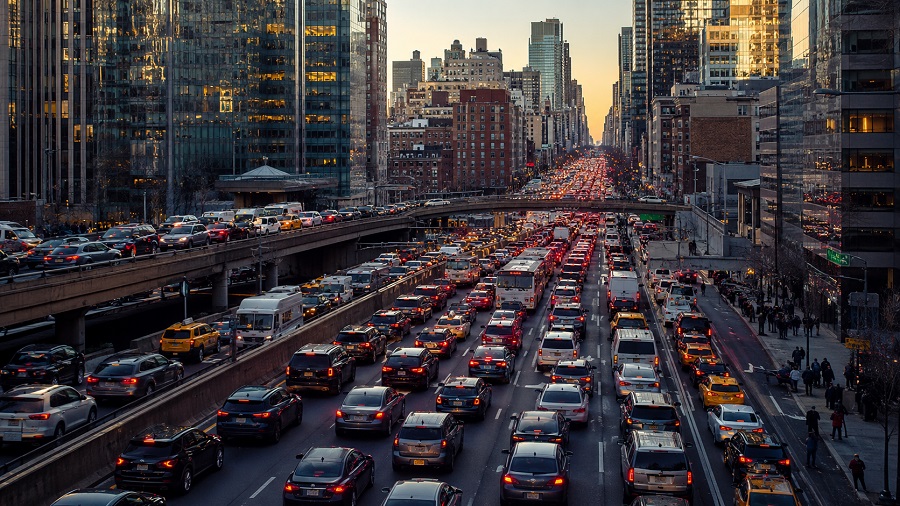
U.S. cities and urban areas by traffic congestion
This 2026 traffic-congestion page uses the latest available INRIX 2025 Global Traffic Scorecard dataset. The main reader-facing measure is annual hours lost per driver in peak-period congestion, while the rank follows INRIX’s U.S. impact ranking, which reflects both congestion severity and the size of the affected urban area.
The INRIX source edition is based on observed commute-trip patterns from 2023 through Q3 2025, with fourth-quarter 2025 values estimated from historical and seasonal trends. The figures should therefore be read as the latest available congestion snapshot used for a 2026 update, not as a forecast of future traffic conditions.
Units are hours lost per driver, year-over-year delay change, and estimated cost per driver in U.S. dollars. The geography is based on urban road-network markets, closer to metro areas than municipal boundaries. San Juan, Puerto Rico is included because it appears in the INRIX U.S. analysis table.
Continue exploring
More StatRanker rankings on health systems, outcomes and medical capacity.
Top 100 Cities by Traffic Congestion in 2026
Open rankingUS Cities by Job Growth, 2026
Open rankingCities by Public Transport Monthly Pass Price, 2026
Open ranking112 hours lost per driver in 2025, moving ahead of New York in the INRIX U.S. impact ranking.
Chicago also has the highest per-driver congestion cost in the Top 25 table.
INRIX estimates the average U.S. driver lost 49 hours to congestion in 2025, up six hours from 2024.
The table uses the published INRIX Top 25 U.S. analysis, including San Juan, Puerto Rico.
What the top of the ranking shows
The leading places are not simply locations with slow traffic. They are large employment markets where peak-period trips concentrate on major corridors, bridges, tunnels, radial highways and downtown approaches. Chicago, New York and Philadelphia combine dense job centers with older regional road networks and heavy commuting flows, which explains why small changes in daily traffic can translate into large annual time losses.
The upper tier also shows that congestion can grow even when travel behavior has not fully returned to pre-pandemic norms. INRIX reports that U.S. traffic delay rose in most analyzed cities, while public transit ridership still lagged 2019 levels. That combination shifts more peak demand onto roads and makes recurring bottlenecks more expensive for households and employers.
A high congestion rank often signals a large urban economy with intense access demand. The practical question is whether roads, transit, land use, parking, freight movement and pricing tools are coordinated well enough to reduce delay on the corridors where it is most costly.
Top 10 urban areas by congestion impact
Chicago ranks first with 112 hours lost per driver. New York City remains second at 102 hours, while Philadelphia rises to third after a 31% increase in delay compared with 2024. Los Angeles and Boston complete the top five, but both show different traffic profiles: Los Angeles has higher downtown speeds in the INRIX table, while Boston has lower downtown speed and a smaller regional cost base.
| Rank | Urban area | Hours lost | Delay change |
|---|---|---|---|
| 1 | Chicago IL | 112 | +10% |
| 2 | New York City NY | 102 | 0% |
| 3 | Philadelphia PA | 101 | +31% |
| 4 | Los Angeles CA | 87 | −1% |
| 5 | Boston MA | 83 | +5% |
| 6 | Miami FL | 75 | +1% |
| 7 | Atlanta GA | 75 | +15% |
| 8 | Houston TX | 70 | +6% |
| 9 | Washington DC | 70 | +13% |
| 10 | Seattle WA | 68 | +8% |
Data source: INRIX 2025 Global Traffic Scorecard, U.S. analysis Top 25 impact ranking. Hours lost are annual hours per driver in peak-period congestion.
Chart: hours lost in the Top 20 impact-ranked urban areas
The chart shows the annual hours lost value for the first 20 urban areas in the INRIX U.S. analysis impact ranking. The rank is not a pure hours-only sort; it reflects the broader impact of congestion in each urban area. This is why some smaller but severe bottleneck markets can sit below larger regions with similar or lower hours lost.
Methodology
The ranking uses the INRIX 2025 Global Traffic Scorecard U.S. impact table as the primary dataset. INRIX defines hours lost as the time lost in congestion during peak commute periods compared with off-peak conditions. The published impact rank is used as the rank column; hours lost and cost per driver are displayed to make the congestion burden easier to compare.
Indicator definition
Hours lost measures the difference between peak-period travel time and free-flow or off-peak travel conditions. In practical terms, it estimates how much extra time the typical driver loses because a commute route is congested rather than moving at its low-traffic speed.
Data year and 2026 update logic
The source edition is the INRIX 2025 Scorecard. INRIX states that the data span 2023 through Q3 2025, with Q4 2025 estimated from historical and seasonal trends. The 2026 label refers to the publication update; the latest available full INRIX dataset is the 2025 Scorecard.
Ranking logic
The rank follows INRIX’s U.S. analysis impact ranking rather than a custom blended score. The impact approach considers congestion severity and the size of the affected urban area. The table also provides hours lost per driver and cost per driver so the rank can be interpreted in everyday terms.
Processing, rounding and limits
Values are reproduced from the published Top 25 table and kept in whole hours, percentage changes and rounded dollar values as reported. Urban areas should not be read as strict municipal boundaries. Comparability is limited by road-network definition, peak-period patterns, downtown corridor selection, construction, weather, special events, remote-work behavior and transit recovery.
Cost per driver is an economic valuation of time lost in congestion, not a direct household bill. It helps compare the annual burden of wasted travel time across urban areas, but it should be interpreted alongside income, commuting patterns, fuel costs, transit availability and freight movement.
TomTom and the Texas A&M Transportation Institute publish useful congestion indicators, but their metrics answer different questions. TomTom focuses on travel time, average speed and congestion level for city networks. TTI’s Urban Mobility Report emphasizes delay, cost and reliability across U.S. urban areas using its own mobility framework. Those sources are used for context only and are not merged into the INRIX rank.
Full ranking: Top 25 urban areas by congestion impact
The table lists the 25 urban areas shown in the INRIX 2025 Scorecard’s U.S. analysis impact ranking. The ranking covers U.S. metro-area road markets and includes San Juan, Puerto Rico as a territory entry. The controls filter or reorder the visible rows without changing the underlying rank.
| Rank | Urban area | Hours lost | Cost per driver |
|---|---|---|---|
| 1 | Chicago IL | 112 | $2,063 |
| 2 | New York City NY | 102 | $1,879 |
| 3 | Philadelphia PA | 101 | $1,860 |
| 4 | Los Angeles CA | 87 | $1,602 |
| 5 | Boston MA | 83 | $1,529 |
| 6 | Miami FL | 75 | $1,381 |
| 7 | Atlanta GA | 75 | $1,381 |
| 8 | Houston TX | 70 | $1,289 |
| 9 | Washington DC | 70 | $1,289 |
| 10 | Seattle WA | 68 | $1,252 |
| 11 | San Juan PR | 68 | $1,252 |
| 12 | Nashville TN | 65 | $1,197 |
| 13 | Baltimore MD | 63 | $1,160 |
| 14 | Denver CO | 51 | $939 |
| 15 | San Francisco CA | 49 | $903 |
| 16 | Pittsburgh PA | 51 | $939 |
| 17 | Stamford CT | 53 | $976 |
| 18 | Charlotte NC | 48 | $884 |
| 19 | Dallas TX | 44 | $810 |
| 20 | Honolulu HI | 49 | $903 |
| 21 | Austin TX | 46 | $847 |
| 22 | Phoenix AZ | 42 | $774 |
| 23 | San Antonio TX | 43 | $792 |
| 24 | Tampa FL | 41 | $755 |
| 25 | Portland OR | 41 | $755 |
Data source: INRIX 2025 Global Traffic Scorecard, U.S. analysis and ranking. Cost per driver values are reported by INRIX using its time-loss valuation method. Region is an editorial grouping added for navigation; it is not an INRIX ranking variable.
Selected year-over-year delay changes in the Top 25
Philadelphia and Baltimore recorded the largest year-over-year increases among the Top 25, both at 31%. These increases help explain why Philadelphia moved higher in the impact ranking while Baltimore remained a major congestion market despite a lower hours-lost total than the top five.
| Urban area | Impact rank | Hours lost | Delay change |
|---|---|---|---|
| Philadelphia PA | 3 | 101 | +31% |
| Baltimore MD | 13 | 63 | +31% |
| Atlanta GA | 7 | 75 | +15% |
| Washington DC | 9 | 70 | +13% |
| Chicago IL | 1 | 112 | +10% |
| New York City NY | 2 | 102 | 0% |
Insights from the congestion ranking
Upper tier: big economies, old corridors and concentrated peaks
Chicago, New York, Philadelphia, Los Angeles and Boston all sit above 80 annual hours lost per driver. These are not identical transportation systems, but they share a common pattern: large job markets, heavy regional commuting, constrained central corridors and high demand on legacy road networks. Philadelphia’s 31% increase is especially important because it signals a sharp rebound in peak-period pressure rather than a stable high-congestion pattern.
Middle tier: Sun Belt growth meets peak-period bottlenecks
Miami, Atlanta, Houston, Washington DC, Nashville and Charlotte show how congestion spreads in regions with strong population growth, suburban job clusters and heavy car dependence. These markets often have wider highways than Northeast cities, but longer trip distances and dispersed commuting can still produce large annual delay totals.
Lower tier of the Top 25: smaller totals do not mean easy mobility
Cities near the bottom of the table still impose meaningful costs. Tampa and Portland each show 41 hours lost per driver, which is lower than Chicago’s figure but still represents a full workweek of annual delay for the typical driver. Lower rank can reflect a smaller urban impact footprint, not a congestion-free road network.
Regional patterns matter. The Northeast dominates the severe, low-speed urban corridor group; the South contributes many growth-driven markets; the West combines large metro economies with constrained geography in places such as Los Angeles, San Francisco, Seattle, Honolulu and Portland. Texas appears repeatedly, showing how fast-growing auto-oriented regions can still accumulate major congestion costs. San Juan’s presence underlines that the INRIX U.S. analysis is not limited to the 50 states.
What traffic congestion means for readers
For residents, hours lost translates into less predictable daily life. A highly congested urban area can impose hidden costs through longer commutes, higher fuel use, more schedule padding, missed appointments and fewer realistic housing or job choices. The cost per driver column gives a comparable estimate of the annual burden, but it is not the same as a direct cash expense paid by every driver.
For businesses, congestion affects labor access, delivery reliability, fleet scheduling, office-location decisions and customer reach. A region may have strong economic demand but still become harder to operate in if peak-period travel becomes unreliable.
For city and state policymakers, the ranking points toward corridor-level interventions rather than one universal fix. Signal coordination, bottleneck repair, bus priority, rail and bus frequency, priced lanes, curb management, parking policy, freight scheduling and housing near job centers can all reduce delay when matched to the right local problem.
For analysts, congestion should be interpreted with complementary data. A high rank can indicate strong access demand as well as transport stress. The key test is whether the region can keep commuting, freight and public transport reliable when road demand rises.
FAQ
Which urban area has the worst traffic congestion in this 2026 update?
Chicago ranks first in the INRIX impact ranking used here, with 112 hours lost per driver in 2025 and an estimated $2,063 cost per driver.
Why is this called a 2026 ranking if the source is the 2025 Scorecard?
The 2026 label refers to the publication update. The latest available full INRIX dataset is the 2025 Scorecard, which covers observed patterns through Q3 2025, with Q4 2025 estimated by INRIX from historical and seasonal patterns.
Why is San Juan PR included in the table?
San Juan appears in the INRIX U.S. analysis table and is shown here as a U.S. territory entry. Its inclusion does not mean the ranking is limited to incorporated U.S. city governments; the geography is based on urban road-network markets.
Is the ranking based only on hours lost?
No. The rank follows INRIX’s impact ranking, which reflects congestion severity and the size of the affected urban area. Hours lost is displayed because it is the clearest way to understand the driver-level burden.
Is cost per driver the amount every commuter pays?
No. Cost per driver is an estimated value of time lost in congestion. It helps compare urban areas, but actual household costs vary by income, trip length, fuel use, parking, vehicle ownership, remote-work options and access to transit.
Why do INRIX, TomTom and TTI rankings differ?
They measure different things. INRIX emphasizes hours lost, impact rank, commute corridors and cost. TomTom focuses on city travel time, speeds and congestion level. TTI uses its own U.S. urban mobility framework for delay, reliability and cost. Different boundaries and formulas can produce different leaders.
Does high congestion mean a city has poor transportation?
Not always. High congestion can reflect strong economic concentration and high access demand. It becomes a deeper policy problem when people lack reliable alternatives, when freight and buses are trapped in the same bottlenecks, or when housing patterns force longer car trips.
Are these city limits or metro areas?
The INRIX urban-area geography is closer to a road-network or metro-area market than a strict municipal boundary. That is why comparisons should be read as urban mobility comparisons, not as city-government performance grades.
How does remote work affect congestion?
Remote and hybrid work can reduce some traditional peak commuting, but the effect is uneven. INRIX notes that U.S. travel has moved closer to pre-COVID congestion levels while transit ridership remains below 2019, which keeps pressure on roads in many cities.
Sources
-
INRIX — 2025 Global Traffic Scorecard
Main source for the impact ranking, hours lost, cost per driver, data-period notes and INRIX methodology. -
INRIX — 2025 Global Traffic Scorecard U.S. press release
Used to verify the national summary, leading urban areas and the broader congestion trend across analyzed U.S. cities. -
TomTom Traffic Index
Used for context only on travel-time and congestion-level comparisons across city road networks. -
Texas A&M Transportation Institute — 2025 Urban Mobility Report
Used for context only on U.S. urban mobility delay, reliability and congestion-cost measures based on 2024 data. -
U.S. Department of Transportation — Valuation of Travel Time Guidance
Used as context for why congestion costs are commonly translated from lost time into monetary values.
Related rankings
More StatRanker rankings on health systems, outcomes and medical capacity.
U.S. Metro Areas by Monthly Rent, 2026
Open rankingUS Cities by Air Quality, 2026
Open rankingCalifornia Cities by Air Quality, 2026
Open rankingMajor U.S. Cities by Average Commute Time, 2026 Snapshot
Open ranking
StatRanker (Website)
administrator