

US Cities by Home Price-to-Income Ratio, 2026
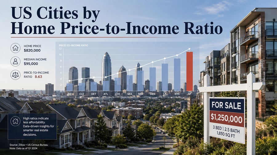
Where U.S. home values stretch furthest beyond local incomes
The home price-to-income ratio compares a city’s typical home price with its median household income. It shows how many years of local median income would equal the typical home price before mortgage rates, taxes, insurance, down payment requirements, and maintenance are added.
The ranking uses the March 2026 Ocity city-level affordability snapshot covering 713 U.S. cities with population above 50,000 and comparable housing and income data. The core metric is PTI = median home price ÷ median household income. Values are shown as ratio points, such as 5.7x or 21.5x, and home prices are shown in U.S. dollars.
Key numbers from the 2026 city ranking
What the upper end of the ranking shows
High ratios cluster in supply-constrained coastal markets
The least affordable group is dominated by California cities, especially in coastal Orange County, Los Angeles County, the Bay Area, and the Central Coast. These markets combine high land values, limited housing supply, strong amenity demand, and incomes that still do not keep pace with home prices.
Continue exploring
More StatRanker rankings on health systems, outcomes and medical capacity.
Top 100 Cities by Housing Affordability (Price-to-Income Ratio), 2025
Open rankingTop 100 Cities by Rent-to-Income Ratio, 2026
Open rankingCalifornia Cities by Median Home Sale Price, 2026
Open rankingLarge cities and smaller affluent cities behave differently
New York and Los Angeles appear because their typical home prices are high relative to local median incomes. Newport Beach, Santa Barbara, Santa Monica, and Redwood City show a different pattern: smaller high-value markets where local housing prices sit far above what a median household income can support.
Top 20 least affordable cities by home price-to-income ratio
These cities have the highest home price-to-income ratio by city in the March 2026 covered-city snapshot. A value of 12.0x means the typical home price is about twelve times the city’s median annual household income.
| Rank | City | Median home price | PTI ratio |
|---|---|---|---|
| 1 | Newport Beach, CA | $3,360,000 | 21.5x |
| 2 | Santa Barbara, CA | $1,917,992 | 19.2x |
| 3 | Santa Monica, CA | $1,802,000 | 16.5x |
| 4 | Costa Mesa, CA | $1,597,000 | 15.7x |
| 5 | Glendale, CA | $1,267,500 | 15.6x |
| 6 | Rochester, NY | $731,000 | 15.0x |
| 7 | Hawthorne, CA | $900,000 | 13.8x |
| 8 | Westminster, CA | $1,100,000 | 13.5x |
| 9 | Boulder, CO | $992,500 | 13.1x |
| 10 | Berkeley, CA | $1,265,000 | 12.9x |
| 11 | Redwood City, CA | $1,950,000 | 12.9x |
| 12 | Los Angeles, CA | $1,002,500 | 12.6x |
| 13 | Carlsbad, CA | $1,650,000 | 12.6x |
| 14 | Irvine, CA | $1,580,699 | 12.4x |
| 15 | Burbank, CA | $1,120,000 | 12.2x |
| 16 | Pasadena, CA | $1,250,000 | 12.1x |
| 17 | Bellingham, WA | $631,780 | 11.5x |
| 18 | New York, NY | $875,000 | 11.4x |
| 19 | Torrance, CA | $1,232,000 | 11.3x |
| 20 | Anaheim, CA | $955,000 | 11.3x |
Source: Ocity 2026 Housing Affordability Index, March 2026 compiled city-level snapshot. The ranking is sorted from highest to lowest PTI ratio.
Chart: highest PTI ratios among covered U.S. cities
The top of the distribution is steep. Newport Beach is above 21x, while the tenth-ranked city, Berkeley, remains close to 13x. That gap shows how concentrated extreme unaffordability is among a narrow group of high-value housing markets.
Methodology
How the ratio is calculated
The ratio compares a city’s reported median home price with its median household income. A PTI of 3.0x means the typical home price is three times median annual household income; a PTI above 10.0x means the typical home costs more than ten years of local median income.
Data year and snapshot logic
The ranking uses a March 2026 city-level snapshot. Home prices are reported in U.S. dollars, income values are based on household income estimates, and the final ratio is rounded to one decimal place. The snapshot combines city-level home price values with income data available for broad geographic comparison.
Sources and processing
Ranking values are taken from Ocity’s compiled city-level 2026 Housing Affordability Index. Ocity identifies Zillow Research, U.S. Census ACS, and BLS-related cost indicators as source categories for its affordability dataset. For the PTI calculation shown here, the relevant inputs are median home price and median household income. BLS indicators are treated only as supporting local cost context and are not used to calculate the PTI values displayed in the tables.
The covered dataset includes cities with population above 50,000 and income above $30,000 where comparable values are available. Ratios are shown to one decimal place. Coverage is limited to the 713 cities included in the source snapshot.
Limitations
PTI is a useful affordability screen, but it is not a full mortgage affordability model. It excludes interest rates, property taxes, homeowners insurance, HOA fees, down payment requirements, credit constraints, household debt, and neighborhood-level differences. It also does not measure rental affordability, although rent burden can be analyzed separately.
Main HTML table: highest and lowest PTI cities
The table below combines the highest-ratio and lowest-ratio cities from the 2026 snapshot. The upper group shows where ownership is most stretched relative to local income; the lower group shows markets where typical home prices remain closer to what local households earn.
| Rank | City | Median home price | PTI ratio |
|---|---|---|---|
| 1 | Newport Beach, CA | $3,360,000 | 21.5x |
| 2 | Santa Barbara, CA | $1,917,992 | 19.2x |
| 3 | Santa Monica, CA | $1,802,000 | 16.5x |
| 4 | Costa Mesa, CA | $1,597,000 | 15.7x |
| 5 | Glendale, CA | $1,267,500 | 15.6x |
| 6 | Rochester, NY | $731,000 | 15.0x |
| 7 | Hawthorne, CA | $900,000 | 13.8x |
| 8 | Westminster, CA | $1,100,000 | 13.5x |
| 9 | Boulder, CO | $992,500 | 13.1x |
| 10 | Berkeley, CA | $1,265,000 | 12.9x |
| 11 | Redwood City, CA | $1,950,000 | 12.9x |
| 12 | Los Angeles, CA | $1,002,500 | 12.6x |
| 13 | Carlsbad, CA | $1,650,000 | 12.6x |
| 14 | Irvine, CA | $1,580,699 | 12.4x |
| 15 | Burbank, CA | $1,120,000 | 12.2x |
| 16 | Pasadena, CA | $1,250,000 | 12.1x |
| 17 | Bellingham, WA | $631,780 | 11.5x |
| 18 | New York, NY | $875,000 | 11.4x |
| 19 | Torrance, CA | $1,232,000 | 11.3x |
| 20 | Anaheim, CA | $955,000 | 11.3x |
| Lowest 1 | Flint, MI | $56,500 | 1.7x |
| Lowest 2 | Midland, TX | $215,000 | 2.4x |
| Lowest 3 | Odessa, TX | $180,000 | 2.4x |
| Lowest 4 | Jackson, MS | $108,000 | 2.6x |
| Lowest 5 | Akron, OH | $130,000 | 2.6x |
| Lowest 6 | Detroit, MI | $99,500 | 2.6x |
| Lowest 7 | Enid, OK | $170,000 | 2.7x |
| Lowest 8 | Peoria, IL | $145,500 | 2.8x |
| Lowest 9 | Lansing, MI | $155,000 | 2.8x |
| Lowest 10 | Toledo, OH | $130,900 | 2.8x |
Source: Ocity 2026 Housing Affordability Index, a compiled city-level ranking snapshot using housing and income source categories that include Zillow Research and U.S. Census ACS.
Insights from the 2026 distribution
Upper tier: extreme ratios are geographically concentrated
The highest PTI cities are not spread evenly across the country. They cluster in California and a few high-demand markets such as Boulder, New York, and Bellingham. This points to structural scarcity and demand concentration rather than a normal national housing pattern.
Middle tier: a 5x–7x market is no longer unusual
The covered-city average of 5.7x shows that many U.S. cities sit above the traditional 3.0x benchmark. The middle of the distribution is therefore not comfortably affordable; it reflects a market where income growth has not fully absorbed home-price gains.
Lower tier: affordability is strongest in older industrial and interior markets
Flint, Akron, Detroit, Toledo, Peoria, and Lansing show much lower ratios because home prices remain closer to local incomes. These cities may offer easier entry into ownership, although buyers still need to evaluate job stability, taxes, insurance, and property condition.
Income alone does not solve affordability
Some high-income cities still rank as unaffordable because their home prices are even higher. PTI is useful because it captures the relationship between local wages and local asset prices, not just the size of either one.
What this means for readers
For homebuyers, PTI is a quick way to screen whether a city’s housing market is broadly aligned with local earning power. A low-ratio city can still have high taxes, insurance costs, or renovation needs, but the purchase price is closer to local income. A high-ratio city usually requires a larger down payment, higher household earnings, outside wealth, or a major compromise on location or property type.
For analysts and policymakers, a persistently high PTI ratio is a warning signal. It can point to zoning constraints, slow housing production, limited developable land, strong investor demand, or a labor market where essential workers cannot afford to live near jobs. The ratio is not a complete housing policy model, but it is a strong starting point for comparing local ownership pressure across cities.
FAQ
What is a good home price-to-income ratio?
A ratio near 3.0x is often used as a simple affordability benchmark. Ratios from 3.1x to 5.0x suggest moderate pressure, while ratios above 5.0x indicate that home prices are high relative to local median household income.
Why can a high-income city still rank as unaffordable?
Because the ratio compares home prices with income. If home values rise faster than local earnings, a city can have high household incomes and still produce a severe affordability ratio.
Is PTI the same as mortgage affordability?
No. PTI is a price-to-income screen. Mortgage affordability also depends on interest rates, down payment, property taxes, insurance, HOA fees, debt levels, and credit conditions.
Why are so many California cities near the top?
Many California markets combine high demand, limited housing supply, constrained land, expensive construction, and strong amenity or job-market appeal. The result is a large gap between typical home values and median household incomes.
Does a low PTI city automatically mean it is the best place to buy?
No. A low ratio can make ownership more reachable, but readers should also consider employment prospects, population trends, local taxes, insurance, school districts, infrastructure, and the condition of the housing stock.
Does the ranking cover every U.S. city?
No. Coverage is limited to the 713 cities included in the March 2026 source snapshot. Smaller municipalities and cities without comparable values are not part of the displayed ranking.
Sources
The links below identify the compiled ranking source, the underlying housing and income data context, and the broader affordability methodology used to interpret price-to-income ratios.
Compiled city-level ranking source for PTI values, city coverage, top and bottom ranked cities, and March 2026 snapshot context.
https://ocity.org/reports/housing-affordability-index-2026Underlying housing data context. Zillow’s Home Value Index is a typical home value measure for homes in the 35th to 65th percentile range for a geography and housing type.
https://www.zillow.com/research/data/Underlying income data context. ACS Table B19013 reports median household income in the past 12 months in inflation-adjusted dollars.
https://data.census.gov/table?q=B19013ACS data access and survey context for income estimates used in local affordability analysis.
https://www.census.gov/programs-surveys/acs/data.htmlSupporting source category for local economic and cost context referenced by the compiled affordability dataset. BLS data is not used to calculate the PTI values shown in the ranking tables.
https://www.bls.gov/Background methodology reference for the difference between a simple price-to-income ratio and a mortgage qualification affordability index.
https://www.nar.realtor/research-and-statistics/housing-statistics/housing-affordability-indexData last checked: May 23, 2026. Values are rounded as shown in the source snapshot.
Related rankings
More StatRanker rankings on health systems, outcomes and medical capacity.
Top 100 Countries by Cost of Housing vs Income, 2026
Open rankingTop 50 U.S. States by Rent Burden (Rent-to-Income %), 2025
Open rankingTop Countries by Home Ownership Rate (Latest Available Data)
Open rankingUS Cities by Salary After Rent, 2026
Open ranking
StatRanker (Website)
administrator