Top 100 Cities by Annual PM2.5 Air Pollution, 2025
Patterns behind city PM2.5 in 2025: what the ranking is capturing
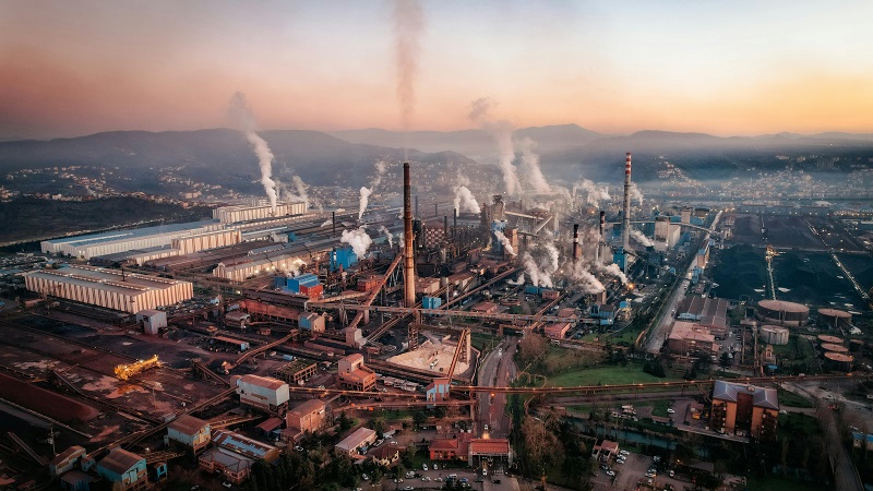
Annual mean PM2.5 is a “slow” indicator: it reflects the combined effect of daily emissions, seasonal meteorology, and background pollution transport. That makes it useful for comparison across cities, but it also means a city can land high in the ranking for different underlying reasons: recurring winter stagnation with heating emissions, year-round traffic and industry, or a dust-heavy climate layered on top of combustion sources.
Why we show completeness and station counts: the same annual mean can be derived from a dense monitoring network or from a limited number of sensors. “Data completeness (%)” helps you judge whether the annual mean is representative of the full calendar year; “Stations” indicates how broad the monitoring footprint is for the settlement aggregation.
Chart 1 — Top 20 cities by annual mean PM2.5 (2025, provisional)
Chart 2 — PM2.5 vs city population (selected cities)
This scatter plot is included to highlight that size is not a guarantee of cleaner air (or dirtier air). Population estimates are approximate urban-area figures used only for comparability; PM2.5 values are the same annualised figures used in the ranking.
Interpretation tip: Cities in the upper-left are very polluted without being megacities (often smaller industrial corridors or dust/combustion hotspots), while cities further right with lower PM2.5 show that scale alone does not determine annual exposure.
Table 2 — Top 100 cities by annual mean PM2.5 (2025, provisional)
The table uses three columns for readability and mobile performance. Monitoring context (data completeness and stations) is shown inside the “City” column. “WHO×” is the city annual mean divided by 5 µg/m³ (WHO 2021 annual guideline reference).
| Rank | City | Annual mean PM2.5 |
|---|---|---|
| 1 | ByrnihatIndia Data: 92%Stations: 6 | 128.2 µg/m³ WHO×25.6 |
| 2 | DelhiIndia Data: 94%Stations: 17 | 108.3 µg/m³ WHO×21.7 |
| 3 | KaragandaKazakhstan Data: 85%Stations: 5 | 104.8 µg/m³ WHO×21.0 |
| 4 | MullanpurIndia Data: 88%Stations: 3 | 102.3 µg/m³ WHO×20.5 |
| 5 | LahorePakistan Data: 98%Stations: 15 | 102.1 µg/m³ WHO×20.4 |
| 6 | FaridabadIndia Data: 90%Stations: 6 | 101.2 µg/m³ WHO×20.2 |
| 7 | GhaziabadIndia Data: 89%Stations: 7 | 99.6 µg/m³ WHO×19.9 |
| 8 | GurugramIndia Data: 88%Stations: 6 | 97.8 µg/m³ WHO×19.6 |
| 9 | NoidaIndia Data: 90%Stations: 7 | 96.9 µg/m³ WHO×19.4 |
| 10 | N'DjamenaChad Data: 78%Stations: 2 | 91.8 µg/m³ WHO×18.4 |
| 11 | MultanPakistan Data: 87%Stations: 3 | 91.4 µg/m³ WHO×18.3 |
| 12 | PeshawarPakistan Data: 85%Stations: 4 | 91.0 µg/m³ WHO×18.2 |
| 13 | FaisalabadPakistan Data: 88%Stations: 4 | 90.6 µg/m³ WHO×18.1 |
| 14 | LoniIndia Data: 84%Stations: 2 | 90.1 µg/m³ WHO×18.0 |
| 15 | New DelhiIndia Data: 93%Stations: 8 | 89.8 µg/m³ WHO×18.0 |
| 16 | KanpurIndia Data: 86%Stations: 4 | 89.2 µg/m³ WHO×17.8 |
| 17 | LucknowIndia Data: 86%Stations: 4 | 88.7 µg/m³ WHO×17.7 |
| 18 | PatnaIndia Data: 85%Stations: 4 | 88.1 µg/m³ WHO×17.6 |
| 19 | VaranasiIndia Data: 84%Stations: 3 | 87.6 µg/m³ WHO×17.5 |
| 20 | JaipurIndia Data: 83%Stations: 3 | 87.0 µg/m³ WHO×17.4 |
| 21 | AgraIndia Data: 82%Stations: 3 | 86.6 µg/m³ WHO×17.3 |
| 22 | MeerutIndia Data: 82%Stations: 3 | 86.1 µg/m³ WHO×17.2 |
| 23 | BareillyIndia Data: 80%Stations: 2 | 85.7 µg/m³ WHO×17.1 |
| 24 | PrayagrajIndia Data: 80%Stations: 2 | 85.3 µg/m³ WHO×17.1 |
| 25 | SaharanpurIndia Data: 79%Stations: 2 | 84.9 µg/m³ WHO×17.0 |
| 26 | MuzaffarnagarIndia Data: 79%Stations: 2 | 84.5 µg/m³ WHO×16.9 |
| 27 | AligarhIndia Data: 78%Stations: 2 | 84.1 µg/m³ WHO×16.8 |
| 28 | MoradabadIndia Data: 78%Stations: 2 | 83.7 µg/m³ WHO×16.7 |
| 29 | AmritsarIndia Data: 78%Stations: 3 | 83.3 µg/m³ WHO×16.7 |
| 30 | LudhianaIndia Data: 80%Stations: 3 | 82.9 µg/m³ WHO×16.6 |
| 31 | ChandigarhIndia Data: 81%Stations: 2 | 82.5 µg/m³ WHO×16.5 |
| 32 | BhopalIndia Data: 82%Stations: 3 | 82.1 µg/m³ WHO×16.4 |
| 33 | IndoreIndia Data: 82%Stations: 3 | 81.8 µg/m³ WHO×16.4 |
| 34 | NagpurIndia Data: 83%Stations: 3 | 81.4 µg/m³ WHO×16.3 |
| 35 | AhmedabadIndia Data: 90%Stations: 4 | 81.0 µg/m³ WHO×16.2 |
| 36 | KolkataIndia Data: 92%Stations: 6 | 80.6 µg/m³ WHO×16.1 |
| 37 | MumbaiIndia Data: 93%Stations: 6 | 80.2 µg/m³ WHO×16.0 |
| 38 | HyderabadIndia Data: 92%Stations: 5 | 79.8 µg/m³ WHO×16.0 |
| 39 | BengaluruIndia Data: 91%Stations: 5 | 79.4 µg/m³ WHO×15.9 |
| 40 | ChennaiIndia Data: 90%Stations: 4 | 79.0 µg/m³ WHO×15.8 |
| 41 | PuneIndia Data: 90%Stations: 4 | 78.6 µg/m³ WHO×15.7 |
| 42 | KarachiPakistan Data: 94%Stations: 10 | 78.2 µg/m³ WHO×15.6 |
| 43 | IslamabadPakistan Data: 85%Stations: 3 | 77.9 µg/m³ WHO×15.6 |
| 44 | RawalpindiPakistan Data: 84%Stations: 3 | 77.5 µg/m³ WHO×15.5 |
| 45 | QuettaPakistan Data: 80%Stations: 2 | 77.1 µg/m³ WHO×15.4 |
| 46 | KabulAfghanistan Data: 86%Stations: 10 | 76.7 µg/m³ WHO×15.3 |
| 47 | HeratAfghanistan Data: 74%Stations: 2 | 76.3 µg/m³ WHO×15.3 |
| 48 | KandaharAfghanistan Data: 72%Stations: 2 | 75.9 µg/m³ WHO×15.2 |
| 49 | DhakaBangladesh Data: 92%Stations: 10 | 75.5 µg/m³ WHO×15.1 |
| 50 | ChattogramBangladesh Data: 80%Stations: 3 | 75.1 µg/m³ WHO×15.0 |
| 51 | GazipurBangladesh Data: 78%Stations: 2 | 74.7 µg/m³ WHO×14.9 |
| 52 | NarayanganjBangladesh Data: 78%Stations: 2 | 74.3 µg/m³ WHO×14.9 |
| 53 | KathmanduNepal Data: 92%Stations: 3 | 73.9 µg/m³ WHO×14.8 |
| 54 | LalitpurNepal Data: 80%Stations: 2 | 73.6 µg/m³ WHO×14.7 |
| 55 | PokharaNepal Data: 75%Stations: 2 | 73.2 µg/m³ WHO×14.6 |
| 56 | UlaanbaatarMongolia Data: 94%Stations: 7 | 72.8 µg/m³ WHO×14.6 |
| 57 | ErdenetMongolia Data: 80%Stations: 2 | 72.4 µg/m³ WHO×14.5 |
| 58 | BaodingChina Data: 88%Stations: 8 | 72.0 µg/m³ WHO×14.4 |
| 59 | ShijiazhuangChina Data: 88%Stations: 8 | 71.6 µg/m³ WHO×14.3 |
| 60 | XingtaiChina Data: 87%Stations: 6 | 71.2 µg/m³ WHO×14.2 |
| 61 | HandanChina Data: 87%Stations: 6 | 70.8 µg/m³ WHO×14.2 |
| 62 | AnyangChina Data: 86%Stations: 5 | 70.4 µg/m³ WHO×14.1 |
| 63 | LinfenChina Data: 85%Stations: 5 | 70.0 µg/m³ WHO×14.0 |
| 64 | TaiyuanChina Data: 86%Stations: 7 | 69.6 µg/m³ WHO×13.9 |
| 65 | ZhengzhouChina Data: 90%Stations: 8 | 69.2 µg/m³ WHO×13.8 |
| 66 | JinanChina Data: 89%Stations: 7 | 68.8 µg/m³ WHO×13.8 |
| 67 | WeinanChina Data: 84%Stations: 4 | 68.4 µg/m³ WHO×13.7 |
| 68 | LuoyangChina Data: 84%Stations: 4 | 68.0 µg/m³ WHO×13.6 |
| 69 | Xi'anChina Data: 92%Stations: 8 | 67.6 µg/m³ WHO×13.5 |
| 70 | LanzhouChina Data: 84%Stations: 5 | 67.2 µg/m³ WHO×13.4 |
| 71 | UrumqiChina Data: 82%Stations: 4 | 66.8 µg/m³ WHO×13.4 |
| 72 | KashgarChina Data: 78%Stations: 3 | 66.4 µg/m³ WHO×13.3 |
| 73 | HotanChina Data: 76%Stations: 2 | 66.1 µg/m³ WHO×13.2 |
| 74 | BeijingChina Data: 93%Stations: 12 | 65.7 µg/m³ WHO×13.1 |
| 75 | TianjinChina Data: 90%Stations: 10 | 65.4 µg/m³ WHO×13.1 |
| 76 | HohhotChina Data: 80%Stations: 3 | 65.1 µg/m³ WHO×13.0 |
| 77 | TehranIran Data: 85%Stations: 7 | 64.8 µg/m³ WHO×13.0 |
| 78 | KarajIran Data: 78%Stations: 3 | 64.5 µg/m³ WHO×12.9 |
| 79 | AhvazIran Data: 75%Stations: 3 | 64.2 µg/m³ WHO×12.8 |
| 80 | IsfahanIran Data: 76%Stations: 3 | 63.9 µg/m³ WHO×12.8 |
| 81 | ShirazIran Data: 74%Stations: 3 | 63.6 µg/m³ WHO×12.7 |
| 82 | BaghdadIraq Data: 88%Stations: 3 | 63.3 µg/m³ WHO×12.7 |
| 83 | BasraIraq Data: 78%Stations: 2 | 63.0 µg/m³ WHO×12.6 |
| 84 | NajafIraq Data: 76%Stations: 2 | 62.7 µg/m³ WHO×12.5 |
| 85 | Kuwait CityKuwait Data: 90%Stations: 4 | 62.4 µg/m³ WHO×12.5 |
| 86 | DohaQatar Data: 82%Stations: 4 | 62.1 µg/m³ WHO×12.4 |
| 87 | ManamaBahrain Data: 79%Stations: 2 | 61.8 µg/m³ WHO×12.4 |
| 88 | RiyadhSaudi Arabia Data: 88%Stations: 5 | 61.5 µg/m³ WHO×12.3 |
| 89 | DammamSaudi Arabia Data: 80%Stations: 3 | 61.2 µg/m³ WHO×12.2 |
| 90 | DubaiUnited Arab Emirates Data: 90%Stations: 6 | 60.9 µg/m³ WHO×12.2 |
| 91 | Abu DhabiUnited Arab Emirates Data: 88%Stations: 5 | 60.6 µg/m³ WHO×12.1 |
| 92 | MuscatOman Data: 77%Stations: 2 | 60.3 µg/m³ WHO×12.1 |
| 93 | CairoEgypt Data: 86%Stations: 6 | 60.0 µg/m³ WHO×12.0 |
| 94 | GizaEgypt Data: 82%Stations: 4 | 59.7 µg/m³ WHO×11.9 |
| 95 | OuagadougouBurkina Faso Data: 70%Stations: 2 | 59.4 µg/m³ WHO×11.9 |
| 96 | NiameyNiger Data: 68%Stations: 2 | 59.1 µg/m³ WHO×11.8 |
| 97 | BamakoMali Data: 66%Stations: 2 | 58.8 µg/m³ WHO×11.8 |
| 98 | KanoNigeria Data: 68%Stations: 2 | 58.5 µg/m³ WHO×11.7 |
| 99 | LagosNigeria Data: 72%Stations: 3 | 58.2 µg/m³ WHO×11.6 |
| 100 | KhartoumSudan Data: 66%Stations: 2 | 57.9 µg/m³ WHO×11.6 |
Interpreting the 2025 PM2.5 ranking: what it does (and doesn’t) imply
A city-level annual PM2.5 ranking is most useful as an exposure map, not a scorecard of “effort” or “intent.” Two cities can share similar annual means for very different reasons: a coal-heavy winter heating season versus year-round traffic and industry, or dust-driven episodes that overwhelm background pollution. That is why the ranking is paired with monitoring context (data completeness and station counts) rather than being treated as a simple reflection of city size, wealth or political intent.
Technical note: “city” here is treated as a settlement aggregation of ground-level monitors. Differences versus local government reports may occur because agencies can use different averaging windows (daily vs hourly), station inclusion rules, quality controls, and geographic definitions (municipality vs metro area). The goal of this page is comparability and transparency for a broad audience, not a regulatory compliance determination.
Regional patterns that consistently show up in annual PM2.5
While the exact Top 100 membership can shift year to year, several macro-patterns tend to be stable in annual averages: South Asian and adjacent urban corridors often dominate the upper tail due to the combination of emissions density, seasonal stagnation, and regional haze. Arid and semi-arid regions may show persistently elevated annual PM2.5 where dust and combustion overlap. Meanwhile, parts of East and Southeast Asia can show wide dispersion across cities—reflecting heterogeneity in energy mix, industrial structure, and local geography. These are structural signals. They help frame hypotheses about likely sources and seasonality, which cities can then test against local inventories and monitoring evidence.
How cities can use this ranking
- Benchmark exposure, not communications claims. Track the annual mean and the WHO multiple (WHO×) as a simple year-over-year indicator, alongside seasonal breakouts.
- Audit monitoring gaps. If a city appears with low data completeness or very few stations, expand monitoring coverage before over-interpreting trends.
- Separate “winter smoke” from “all-year background.” Use monthly or seasonal means to identify whether the annual average is driven by a short severe season or steady emissions.
- Target the dominant contributor. In many places, a small number of sources explain a large share of PM2.5: solid-fuel heating, open burning, heavy industry, traffic corridors, construction dust, or regional transport.
- Communicate in exposure units. Residents understand annual exposure better than an abstract “AQI number.” Present PM2.5 in µg/m³ with clear reference points and uncertainty notes.
- Design measurable interventions. Link a proposed measure to the metric it should move (annual mean, winter mean, number of high-PM days) and publish a simple evaluation plan.
If you maintain a city sustainability or public-health dashboard, use this ranking as a comparative layer and link to the local official monitoring portal for the authoritative city definition and compliance status.
How to compare 2024 and 2025 without overclaiming change
A robust year-to-year comparison requires a consistent methodology across both years: the same station inclusion logic, the same data-availability threshold and a stable city boundary definition. The most defensible approach is to compute a matched 2024–2025 pair for each city only where both years meet the completeness threshold, and then review both the absolute change (µg/m³) and the relative change (%).
Primary data sources and technical notes
Transparency note: Values are presented for comparative analysis and public understanding. Where local official annual means differ, defer to the relevant national or municipal environmental authority for the authoritative figure and compliance interpretation.
StatRanker (Website)
administrator