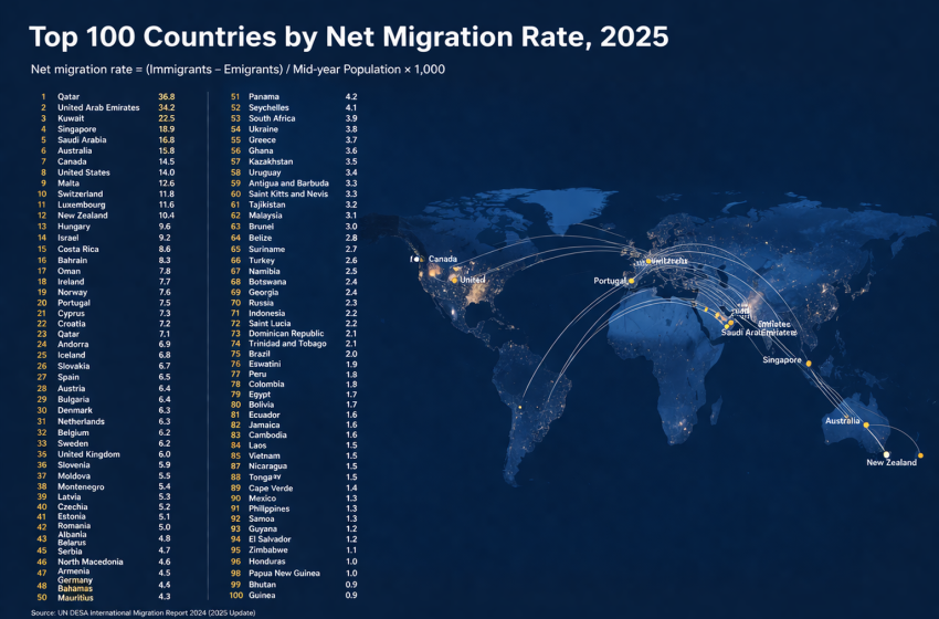
Top 100 Countries by Net Migration Rate, 2025
Migration · International mobility · Current ranking snapshot
Where net migration is strongest in the 2025 snapshot
Net migration rate measures the difference between people entering and leaving a country during the year, scaled per 1,000 residents. That scaling is what makes the metric useful. It does not tell you which country received the largest absolute number of migrants. It tells you where net movement is most intense relative to population size.
For this 2025 ranking, the article uses the archived 2024 CIA World Factbook country-comparison table as the cleanest cross-country ordering still available in one comparable list, while the World Bank indicator metadata and the United Nations World Population Prospects 2024 framework are used for definition and interpretation. That choice is intentional: this is a current ranking snapshot built on the latest comparable estimate set, not a pretend “finished 2025” census-style count.
The metric is easiest to read this way. A high positive value means strong net inward movement relative to population. A value near zero does not mean a country is migration-free; it means inflows and outflows are roughly balancing at the annual per-capita level.
One important editorial choice in this rewrite is caution around the outliers. Ukraine, South Sudan and Venezuela are treated as special cases where conflict, returns, border volatility or denominator effects may dominate what would otherwise look like a standard destination story.
Top 10 countries and territories by net migration rate
The top of the ranking is not led by the world’s largest economies. It is led by places where a relatively small resident base magnifies annual movement. That is why wealthy microstates, island territories, labor-import systems, and conflict-linked cases can appear side by side. The ranking is real, but the stories behind the numbers are not interchangeable.
Ukraine
36.5 migrants per 1,000 residents
This is not a conventional immigration story. The 36.5 rate is better read as an exceptional wartime demographic balance signal shaped by displacement, partial returns, and unstable cross-border conditions rather than by a normal peacetime pull factor.
South Sudan
19.1 migrants per 1,000 residents
South Sudan’s position is better read as a conflict-linked mobility signal than as a conventional destination ranking. Refugee movements, regional insecurity, and weak border registration can all amplify the annual net balance.
Venezuela
13.2 migrants per 1,000 residents
A positive annual estimate does not erase the broader story of outward migration from Venezuela. It suggests that, in this specific estimate window, return flows and short-term border dynamics may have partly offset longer-run emigration pressure.
British Virgin Islands
12.9 migrants per 1,000 residents
Small-island arithmetic matters here. Even moderate inflows tied to services, construction, and tourism can look very large once they are scaled to a tiny resident population.
Cayman Islands
12.1 migrants per 1,000 residents
The Cayman Islands illustrate why migration intensity is different from migration size. A territory can rank near the top without receiving net migrant numbers comparable to those of large sovereign states.
Equatorial Guinea
12.1 migrants per 1,000 residents
Equatorial Guinea is a specialized case in which shifts in foreign labor demand and a small population base can move the rate quickly. It is not one of the world’s broadest migration destinations by absolute scale.
Monaco
11.7 migrants per 1,000 residents
Monaco’s ranking reflects classic microstate dynamics: a high-income residence market, limited domestic space, and a resident base small enough for modest inflows to create a strong per-capita effect.
Luxembourg
10.8 migrants per 1,000 residents
Luxembourg is one of the clearest examples of a rich, labor-absorbing economy that can sustain positive net migration over time. Unlike the conflict-linked outliers above it, its ranking fits a more conventional destination pattern.
Anguilla
10.3 migrants per 1,000 residents
As with other Caribbean territories, the ranking is driven less by sheer migrant volume than by how quickly even a narrow inflow can reshape a small population base.
Turks and Caicos Islands
8.3 migrants per 1,000 residents
Turks and Caicos close the top 10 under the same small-territory logic: tourism and construction demand matter, but scale is the main reason the rate sits so high.
Table 1. Top 10 by net migration rate, 2025 snapshot
| Rank | Country or territory | Rate per 1,000 | Reading |
|---|---|---|---|
| 1 | Ukraine | 36.5 | strong net inflow |
| 2 | South Sudan | 19.1 | strong net inflow |
| 3 | Venezuela | 13.2 | strong net inflow |
| 4 | British Virgin Islands | 12.9 | strong net inflow |
| 5 | Cayman Islands | 12.1 | strong net inflow |
| 6 | Equatorial Guinea | 12.1 | strong net inflow |
| 7 | Monaco | 11.7 | strong net inflow |
| 8 | Luxembourg | 10.8 | strong net inflow |
| 9 | Anguilla | 10.3 | strong net inflow |
| 10 | Turks and Caicos Islands | 8.3 | strong net inflow |
Values reflect the archived CIA World Factbook 2024 estimate set and are used here as a 2025 proxy. The full top 100 appears below in the same HTML source.
Chart 1. Top 20 net migration rates
By rank 20 the rate has already fallen from 36.5 in Ukraine to 4.7 in Liechtenstein. That drop is the first clue that the distribution is sharply top-heavy. A handful of outliers sit far above a much denser middle.
- Ukraine — 36.5 per 1,000
- South Sudan — 19.1 per 1,000
- Venezuela — 13.2 per 1,000
- British Virgin Islands — 12.9 per 1,000
- Cayman Islands — 12.1 per 1,000
- Equatorial Guinea — 12.1 per 1,000
- Monaco — 11.7 per 1,000
- Luxembourg — 10.8 per 1,000
- Anguilla — 10.3 per 1,000
- Turks and Caicos Islands — 8.3 per 1,000
- Aruba — 8 per 1,000
- Saudi Arabia — 6.7 per 1,000
- Cyprus — 6.3 per 1,000
- Switzerland — 5.9 per 1,000
- Australia — 5.9 per 1,000
- Sint Maarten — 5.7 per 1,000
- Ireland — 5.6 per 1,000
- San Marino — 5.6 per 1,000
- Canada — 5.3 per 1,000
- Liechtenstein — 4.7 per 1,000
If the chart does not render, the fallback list remains visible and preserves the ranking context.
Methodology
This page is designed as a current ranking snapshot rather than a historical research paper. The ranking itself is taken from the archived CIA World Factbook country-comparison table for net migration rate because it offers a single cross-country list with broad coverage and a common definition: the difference between people entering and leaving a country during the year, per 1,000 persons based on midyear population.
Because 2025 is not a fully observed statistical year in the major migration datasets, the article uses the 2024 estimate set as a practical 2025 snapshot proxy. The World Bank indicator page confirms that the net migration series is sourced from the United Nations Population Division and is available through 2025 in the World Development Indicators metadata. The UN World Population Prospects 2024 methodology is then used to explain what sits behind such numbers: in many countries, net migration is not a direct count of all inflows and outflows, but an estimated balancing component informed by census change, fertility, mortality, labor migration information, refugee statistics and other contextual inputs.
That matters because the indicator is powerful but limited. Net migration rate is not the same as immigrant stock, not the same as visas issued, not the same as refugee totals, and not the same as annual arrivals. In countries with equal inflows and outflows, net migration can be zero even when mobility is substantial. In conflict-affected settings it may reflect returns, displacement or rapid demographic rebalancing rather than a straightforward destination signal.
What was checked before interpreting the outliers
- The ranking was kept tied to a single comparable estimate source rather than mixing incompatible country tables.
- Country notes for Ukraine, South Sudan and Venezuela were deliberately toned down to avoid reading an annual net balance as a clean immigration “success” story.
- Small territories were flagged as denominator-sensitive cases so the reader can separate migration intensity from migration size.
- Region and profile filters in the table below are editorial browsing tools, not official source classifications.
Insights and takeaways
1. Small territories dominate because scale dominates
A territory does not need huge migrant numbers to rank near the top. It only needs a strong annual balance relative to a very small resident base. That is why the British Virgin Islands, Cayman Islands, Anguilla, Aruba and Monaco sit so high.
2. Conflict can push a country upward for reasons that have little to do with attractiveness
Ukraine and South Sudan are the clearest warning against shallow ranking logic. A positive net migration estimate in such cases can be shaped by return movements, humanitarian relocation, regional spillovers and volatile measurement conditions. It should not be packaged as a standard “top destination” story.
3. Rich labor-import systems still stand out
Luxembourg, Saudi Arabia, Switzerland, Australia, Canada and Singapore are easier to read in a conventional destination framework. Their labor markets, wage levels and residence structures help sustain positive net inward movement over time.
4. The ranking compresses very quickly toward zero
This is one of the most useful things the full top 100 reveals. Once the list moves away from the outliers, many countries cluster in the 1 to 4.9 range, then the ranking flattens into near-balance readings. A country can still be in the top 100 with 0.0 or even slightly negative net migration because the global middle of the distribution is not dramatic.
5. One migration metric is never enough
A country can rank high here and still be modest in foreign-born share. Another country can sit near zero while remaining a major remittance recipient or a large source of emigrants abroad. Net migration rate is best used together with immigrant stock, remittances, diaspora scale and country-specific policy context.
What this means for the reader
If you are comparing work or relocation destinations, this ranking helps identify where inward movement is currently strong relative to population. That often signals labour demand, tourism-construction cycles, safe-haven behaviour or residence-market pressure. It does not tell you whether legal entry is easy, cheap or permanent.
If you are reading migration through an investment, housing or infrastructure lens, the per-capita framing is the point. A high rate in a small territory can affect rents, transport, school capacity and labour shortages very quickly. If you are reading it through a diaspora or remittance lens, countries near zero still matter because annual net balance can hide much larger outward communities already living abroad.
FAQ
+Why is Ukraine first in this ranking?
Because the archived 2024 estimate table places Ukraine at 36.5 per 1,000. In editorial terms, that number should be read as an exceptional wartime demographic balance signal shaped by displacement, partial returns and unstable cross-border movement, not as a normal peacetime immigration boom.
+Does a high net migration rate mean the country has the biggest immigrant population?
No. The rate is scaled per 1,000 residents. A small territory can rank above a very large economy even when its absolute inflow is far smaller.
+Why do islands and microstates show up so often near the top?
Because the denominator is tiny. A modest change in annual arrivals or departures can become a large per-capita number very quickly.
+Can a positive rate reflect crisis rather than prosperity?
Yes. In some countries a positive annual net rate can reflect return migration, humanitarian movement, conflict displacement or regional spillovers rather than a simple labor-market pull.
+How should I read a value like 3 per 1,000?
It means net inward migration equal to about 0.3 percent of the resident population over the year. It is an intensity signal, not a direct count of all arrivals.
+Why is 2024 used as a proxy for 2025?
Because migration datasets are published with lags and 2025 is not a fully observed year in the major cross-country demographic series. Using the latest comparable estimate set is more honest than pretending a finished 2025 ranking already exists.
Full Top 100 table: from extreme inflow outliers to near balance
Once the ranking moves beyond the first 20 or 30 entries, the picture changes. The table stops being only a list of migration magnets and becomes a spectrum: strong inflow at the top, then ordinary net gains, then near-balance values, and finally slight net outflow at the edge of the top 100. That is exactly why a full table is useful. It shows how quickly the ranking stops being dramatic and starts being subtle.
All 100 rows are embedded directly in the HTML source below. Search, sorting and filters only hide or reorder existing rows. If JavaScript is disabled, the table stays fully visible in ranking order.
| Rank | Country or territory | Rate | 2025 reading |
|---|---|---|---|
| 1 | Ukraine | 36.5 per 1,000 3.65% of population | strong net inflow |
| 2 | South Sudan | 19.1 per 1,000 1.91% of population | strong net inflow |
| 3 | Venezuela | 13.2 per 1,000 1.32% of population | strong net inflow |
| 4 | British Virgin Islands | 12.9 per 1,000 1.29% of population | strong net inflow |
| 5 | Cayman Islands | 12.1 per 1,000 1.21% of population | strong net inflow |
| 6 | Equatorial Guinea | 12.1 per 1,000 1.21% of population | strong net inflow |
| 7 | Monaco | 11.7 per 1,000 1.17% of population | strong net inflow |
| 8 | Luxembourg | 10.8 per 1,000 1.08% of population | strong net inflow |
| 9 | Anguilla | 10.3 per 1,000 1.03% of population | strong net inflow |
| 10 | Turks and Caicos Islands | 8.3 per 1,000 0.83% of population | strong net inflow |
| 11 | Aruba | 8 per 1,000 0.80% of population | strong net inflow |
| 12 | Saudi Arabia | 6.7 per 1,000 0.67% of population | strong net inflow |
| 13 | Cyprus | 6.3 per 1,000 0.63% of population | strong net inflow |
| 14 | Switzerland | 5.9 per 1,000 0.59% of population | strong net inflow |
| 15 | Australia | 5.9 per 1,000 0.59% of population | strong net inflow |
| 16 | Sint Maarten | 5.7 per 1,000 0.57% of population | strong net inflow |
| 17 | Ireland | 5.6 per 1,000 0.56% of population | strong net inflow |
| 18 | San Marino | 5.6 per 1,000 0.56% of population | strong net inflow |
| 19 | Canada | 5.3 per 1,000 0.53% of population | strong net inflow |
| 20 | Liechtenstein | 4.7 per 1,000 0.47% of population | net inflow |
| 21 | Malta | 4.4 per 1,000 0.44% of population | net inflow |
| 22 | Isle of Man | 4.3 per 1,000 0.43% of population | net inflow |
| 23 | Djibouti | 4.2 per 1,000 0.42% of population | net inflow |
| 24 | Singapore | 4.2 per 1,000 0.42% of population | net inflow |
| 25 | Spain | 4.1 per 1,000 0.41% of population | net inflow |
| 26 | Sweden | 4 per 1,000 0.40% of population | net inflow |
| 27 | Belgium | 4 per 1,000 0.40% of population | net inflow |
| 28 | Norway | 3.9 per 1,000 0.39% of population | net inflow |
| 29 | New Zealand | 3.8 per 1,000 0.38% of population | net inflow |
| 30 | New Caledonia | 3.6 per 1,000 0.36% of population | net inflow |
| 31 | Gabon | 3.5 per 1,000 0.35% of population | net inflow |
| 32 | Austria | 3.5 per 1,000 0.35% of population | net inflow |
| 33 | Italy | 3.4 per 1,000 0.34% of population | net inflow |
| 34 | Bahamas, The | 3.2 per 1,000 0.32% of population | net inflow |
| 35 | Macau | 3.1 per 1,000 0.31% of population | net inflow |
| 36 | Panama | 3 per 1,000 0.30% of population | net inflow |
| 37 | Netherlands | 3 per 1,000 0.30% of population | net inflow |
| 38 | United States | 3 per 1,000 0.30% of population | net inflow |
| 39 | United Kingdom | 2.9 per 1,000 0.29% of population | net inflow |
| 40 | Czechia | 2.7 per 1,000 0.27% of population | net inflow |
| 41 | Denmark | 2.7 per 1,000 0.27% of population | net inflow |
| 42 | Botswana | 2.7 per 1,000 0.27% of population | net inflow |
| 43 | Korea, South | 2.6 per 1,000 0.26% of population | net inflow |
| 44 | Hungary | 2.5 per 1,000 0.25% of population | net inflow |
| 45 | Iceland | 2.5 per 1,000 0.25% of population | net inflow |
| 46 | Suriname | 2.5 per 1,000 0.25% of population | net inflow |
| 47 | Finland | 2.2 per 1,000 0.22% of population | net inflow |
| 48 | Brunei | 2.1 per 1,000 0.21% of population | net inflow |
| 49 | Antigua and Barbuda | 2 per 1,000 0.20% of population | net inflow |
| 50 | Belize | 2 per 1,000 0.20% of population | net inflow |
| 51 | Israel | 1.9 per 1,000 0.19% of population | net inflow |
| 52 | Costa Rica | 1.9 per 1,000 0.19% of population | net inflow |
| 53 | Germany | 1.8 per 1,000 0.18% of population | net inflow |
| 54 | Hong Kong | 1.6 per 1,000 0.16% of population | net inflow |
| 55 | Guernsey | 1.6 per 1,000 0.16% of population | net inflow |
| 56 | Portugal | 1.5 per 1,000 0.15% of population | net inflow |
| 57 | Malaysia | 1.5 per 1,000 0.15% of population | net inflow |
| 58 | Slovenia | 1.5 per 1,000 0.15% of population | net inflow |
| 59 | Bermuda | 1.4 per 1,000 0.14% of population | net inflow |
| 60 | Sierra Leone | 1.4 per 1,000 0.14% of population | net inflow |
| 61 | Jersey | 1.2 per 1,000 0.12% of population | net inflow |
| 62 | Cote d'Ivoire | 1.1 per 1,000 0.11% of population | net inflow |
| 63 | Greece | 1.1 per 1,000 0.11% of population | net inflow |
| 64 | Saint Kitts and Nevis | 1.1 per 1,000 0.11% of population | net inflow |
| 65 | France | 1.1 per 1,000 0.11% of population | net inflow |
| 66 | Taiwan | 1.1 per 1,000 0.11% of population | net inflow |
| 67 | Belarus | 0.8 per 1,000 0.08% of population | near-balance inflow |
| 68 | Russia | 0.8 per 1,000 0.08% of population | near-balance inflow |
| 69 | Seychelles | 0.8 per 1,000 0.08% of population | near-balance inflow |
| 70 | Japan | 0.7 per 1,000 0.07% of population | near-balance inflow |
| 71 | Palau | 0.7 per 1,000 0.07% of population | near-balance inflow |
| 72 | North Macedonia | 0.4 per 1,000 0.04% of population | near-balance inflow |
| 73 | Slovakia | 0.4 per 1,000 0.04% of population | near-balance inflow |
| 74 | Chile | 0.3 per 1,000 0.03% of population | near-balance inflow |
| 75 | Benin | 0.2 per 1,000 0.02% of population | near-balance inflow |
| 76 | Zambia | 0.1 per 1,000 0.01% of population | near-balance inflow |
| 77 | India | 0.1 per 1,000 0.01% of population | near-balance inflow |
| 78 | Mauritius | 0 per 1,000 0.00% of population | near balance |
| 79 | Andorra | 0 per 1,000 0.00% of population | near balance |
| 80 | Gambia, The | 0 per 1,000 0.00% of population | near balance |
| 81 | Moldova | 0 per 1,000 0.00% of population | near balance |
| 82 | Serbia | 0 per 1,000 0.00% of population | near balance |
| 83 | Montserrat | 0 per 1,000 0.00% of population | near balance |
| 84 | Iraq | 0 per 1,000 0.00% of population | near balance |
| 85 | Madagascar | 0 per 1,000 0.00% of population | near balance |
| 86 | Croatia | 0 per 1,000 0.00% of population | near balance |
| 87 | Namibia | 0 per 1,000 0.00% of population | near balance |
| 88 | Malawi | 0 per 1,000 0.00% of population | near balance |
| 89 | Guinea | 0 per 1,000 0.00% of population | near balance |
| 90 | Saint Helena, Ascension, and Tristan da Cunha | 0 per 1,000 0.00% of population | near balance |
| 91 | Korea, North | 0 per 1,000 0.00% of population | near balance |
| 92 | Bhutan | 0 per 1,000 0.00% of population | near balance |
| 93 | Faroe Islands | 0 per 1,000 0.00% of population | near balance |
| 94 | Papua New Guinea | 0 per 1,000 0.00% of population | near balance |
| 95 | Paraguay | -0.1 per 1,000 -0.01% of population | mild net outflow |
| 96 | Ethiopia | -0.1 per 1,000 -0.01% of population | mild net outflow |
| 97 | Congo, Republic of the | -0.1 per 1,000 -0.01% of population | mild net outflow |
| 98 | Argentina | -0.1 per 1,000 -0.01% of population | mild net outflow |
| 99 | Afghanistan | -0.1 per 1,000 -0.01% of population | mild net outflow |
| 100 | China | -0.1 per 1,000 -0.01% of population | mild net outflow |
Source basis: CIA World Factbook archive, 2024 estimate set, used here as a 2025 ranking proxy. Region and profile filters are browsing aids for this article rather than official source classifications.
Chart 2. How the Top 100 compresses toward zero
The most important structural fact in the table is compression. Only a small number of places sit at 10 or more migrants per 1,000. Most of the top 100 is clustered in the 1 to 4.9 range, then near-balance values take over. This is why a Top 100 migration-rate page can still be analytically useful even when the bottom of the group is almost flat.
- 10+ per 1,000 — 9 countries or territories
- 5.0–9.9 per 1,000 — 10
- 1.0–4.9 per 1,000 — 47
- 0.1–0.9 per 1,000 — 11
- 0.0 per 1,000 — 17
- Below 0 — 6
Band counts are calculated from the same 100 rows already embedded in the table, so the visual and the HTML source stay aligned.
How to interpret the net migration hierarchy in 2025
The ranking is best read as a measure of migration intensity, not migration size. That distinction matters. A very high rate does not automatically mean a country is one of the world’s biggest migrant destinations in absolute terms. It means net inward movement is large relative to the resident population. For small territories that can happen quickly. For large countries it usually takes exceptional circumstances or sustained labour-market pull.
That is why the table mixes very different stories. Ukraine and South Sudan sit at the top for reasons that are not comparable to Luxembourg, Switzerland, Australia or Canada. Saudi Arabia represents yet another model, built around foreign labour demand and temporary migration structures. Looking only at rank without reading context produces shallow conclusions, and this is exactly where many ranking pages go wrong.
The lower end of the top 100 matters too. Countries around 0.0 or −0.1 are not migration-free. They may still have very large diaspora networks, major remittance dependence, substantial student mobility or large foreign-born communities built over earlier decades. They simply are not recording strong net gains in this specific annual per-capita lens.
Policy takeaways
- Housing and infrastructure pressure can appear fastest in smaller destinations where a high migration rate meets limited capacity.
- Conflict-linked positive readings should not be romanticized. They may reflect return or humanitarian dynamics rather than broad economic strength.
- Near-zero countries still matter in migration policy because diaspora size, remittances and transit roles can remain large even when annual net balance looks flat.
- Labor-import systems are best read together with foreign-worker share, visa structure, and turnover rates, not through one indicator alone.
- Comparisons work best when territories are flagged honestly. If the source includes dependencies and microstates, they belong in the data, but scale must be stated openly.
How this page fits the wider migration cluster
This ranking answers one specific question: where is net migration strongest relative to population right now? It does not answer who hosts the largest immigrant stock, who has the biggest diaspora abroad, or which economies receive the largest remittance inflows. Those are separate ranking intents and deserve separate pages.
That separation is useful for readers. A country can rank high on net migration rate but much lower on foreign-born share. Another can sit near balance here while remaining one of the world’s more remittance-dependent economies. The strongest migration clusters do not blur those signals together; they link them clearly.
Official and primary-source links
For formal policy or academic work, go back to the original databases and documentation. A ranking page should organise the question cleanly and honestly; it should not pretend to replace source-level methodological notes.