

Top 100 Countries by PM2.5 Air Pollution (Annual Mean), 2025
PM2.5 is “fine particulate matter” — particles small enough to reach deep into the lungs. This page ranks countries by population-weighted annual mean exposure (µg/m³), which is a practical way to summarize the air people breathe where they actually live. The goal is not to sensationalize a single number, but to show who sits at the top of the risk stack, how patterns differ by region, and what typically drives high exposure.
What PM2.5 means (in plain English)
PM2.5 is not a single substance — it’s a mixture. It can include soot from combustion, secondary particles formed from sulfur and nitrogen oxides (sulfates and nitrates), organic aerosols, and fine dust. Because the particles are tiny, they travel farther in the air and stay suspended longer than larger dust, which is why they can affect big populations at once.
The metric used here is population-weighted exposure. That matters: a country can have a “moderate” geographic average but a “high” population-weighted number if a large share of people live in polluted cities or industrial corridors. It answers a direct reader question: “How polluted is the air where people actually are?”
- Units: µg/m³ (micrograms per cubic meter).
- Annual mean: a full-year average (captures chronic, long-term exposure).
- Comparable ranking: designed for cross-country comparisons, not neighborhood-level decisions.
For “street-level” detail, use the city ranking page (internal link is in Part 3).
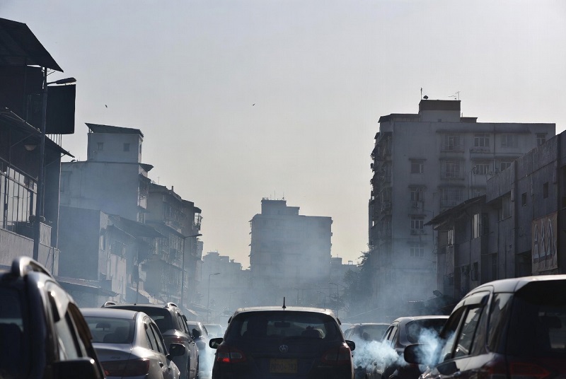
Health burden: why PM2.5 is a top global risk factor
PM2.5 is strongly associated with major health outcomes because it can trigger inflammation and oxidative stress in the respiratory system and can enter the bloodstream. Over time, higher exposure is linked to increased risks of cardiovascular disease (including stroke and ischemic heart disease), chronic respiratory illness (including COPD), aggravated asthma, and other harms that translate into higher premature mortality at population scale.
What makes PM2.5 especially important for rankings is that it combines intensity (how high concentrations are) with coverage (how many people breathe that air). In practice, a country’s burden tends to be “worst” when high pollution is persistent across seasons and affects large populations in dense urban or peri-urban areas. That’s also why “one spectacular smog episode” is less informative than the annual mean: chronic exposure is where the largest long-run health costs accumulate.
- Most affected systems: heart + blood vessels, lungs, and immune response.
- Most vulnerable groups: children, older adults, pregnant people, and anyone with chronic conditions.
- Why annual mean matters: it tracks long-term risk, not only short-term spikes.
Top 20 countries with the highest annual PM2.5 exposure
Horizontal bars prevent the “giant empty height” problem and keep labels readable. Axis labels are black and at least 15px.
The top of the ranking is a mix of contexts: dense combustion corridors (South Asia), dust-amplified environments (parts of MENA), and regions where monitoring is sparse and exposure estimates rely heavily on integrated modeling. In Part 3 we translate these patterns into drivers and reader takeaways.
Top 100 countries (annual mean PM2.5)
Below is the full Top 100 ranking by population-weighted annual mean PM2.5 (µg/m³). The “× WHO (5)” column compares each value to the WHO 2021 annual guideline of 5 µg/m³ (a health-based benchmark). This is the quickest way for a reader to understand magnitude: 25 µg/m³ is about 5× the guideline; 50 µg/m³ is about 10×.
| Rank | Country | PM2.5 (µg/m³) | × WHO (5) |
|---|---|---|---|
| 1 | Nepal | 99.73 | 19.9× |
| 2 | Niger | 94.05 | 18.8× |
| 3 | Qatar | 91.19 | 18.2× |
| 4 | India | 90.87 | 18.2× |
| 5 | Saudi Arabia | 87.95 | 17.6× |
| 6 | Egypt | 87.00 | 17.4× |
| 7 | Cameroon | 72.79 | 14.6× |
| 8 | Nigeria | 71.80 | 14.4× |
| 9 | Bahrain | 70.82 | 14.2× |
| 10 | Chad | 66.03 | 13.2× |
| 11 | Iraq | 61.64 | 12.3× |
| 12 | Bangladesh | 60.85 | 12.2× |
| 13 | Kuwait | 60.75 | 12.1× |
| 14 | Pakistan | 58.28 | 11.7× |
| 15 | Afghanistan | 56.91 | 11.4× |
| 16 | Central African Republic | 56.83 | 11.4× |
| 17 | Sudan | 55.37 | 11.1× |
| 18 | Libya | 54.25 | 10.9× |
| 19 | Equatorial Guinea | 53.24 | 10.6× |
| 20 | China | 52.66 | 10.5× |
| 21 | Uganda | 50.49 | 10.1× |
| 22 | Yemen | 50.46 | 10.1× |
| 23 | Eritrea | 48.03 | 9.6× |
| 24 | Mauritania | 47.42 | 9.5× |
| 25 | Congo | 46.64 | 9.3× |
| 26 | Tajikistan | 46.15 | 9.2× |
| 27 | Djibouti | 45.55 | 9.1× |
| 28 | Democratic Republic of the Congo | 44.91 | 9.0× |
| 29 | Gabon | 44.39 | 8.9× |
| 30 | Turkey | 44.31 | 8.9× |
| 31 | Syrian Arab Republic | 43.76 | 8.8× |
| 32 | Rwanda | 43.21 | 8.6× |
| 33 | Burkina Faso | 42.94 | 8.6× |
| 34 | Oman | 41.12 | 8.2× |
| 35 | United Arab Emirates | 40.92 | 8.2× |
| 36 | Senegal | 40.70 | 8.1× |
| 37 | Mongolia | 40.11 | 8.0× |
| 38 | Benin | 39.00 | 7.8× |
| 39 | Iran | 38.98 | 7.8× |
| 40 | Ethiopia | 38.98 | 7.8× |
| 41 | Burundi | 38.90 | 7.8× |
| 42 | Algeria | 38.88 | 7.8× |
| 43 | Mali | 38.53 | 7.7× |
| 44 | Bhutan | 37.93 | 7.6× |
| 45 | Tunisia | 37.66 | 7.5× |
| 46 | Togo | 35.73 | 7.1× |
| 47 | Myanmar | 35.56 | 7.1× |
| 48 | Cabo Verde | 34.78 | 7.0× |
| 49 | Ghana | 34.71 | 6.9× |
| 50 | The Gambia | 33.98 | 6.8× |
| 51 | Jordan | 33.01 | 6.6× |
| 52 | Morocco | 32.59 | 6.5× |
| 53 | Armenia | 32.53 | 6.5× |
| 54 | Angola | 32.39 | 6.5× |
| 55 | Somalia | 32.03 | 6.4× |
| 56 | Democratic People’s Republic of Korea | 32.01 | 6.4× |
| 57 | Lebanon | 30.62 | 6.1× |
| 58 | Guinea-Bissau | 29.77 | 6.0× |
| 59 | North Macedonia | 29.73 | 5.9× |
| 60 | Vietnam | 29.63 | 5.9× |
| 61 | Tanzania | 29.08 | 5.8× |
| 62 | Kenya | 28.58 | 5.7× |
| 63 | São Tomé and Príncipe | 28.54 | 5.7× |
| 64 | Uzbekistan | 28.46 | 5.7× |
| 65 | Lesotho | 28.03 | 5.6× |
| 66 | Bosnia and Herzegovina | 27.75 | 5.6× |
| 67 | Zambia | 27.44 | 5.5× |
| 68 | Thailand | 26.26 | 5.3× |
| 69 | Guinea | 26.06 | 5.2× |
| 70 | Côte d’Ivoire | 25.89 | 5.2× |
| 71 | Cambodia | 25.61 | 5.1× |
| 72 | Namibia | 25.36 | 5.1× |
| 73 | Lao PDR | 25.11 | 5.0× |
| 74 | South Africa | 25.10 | 5.0× |
| 75 | Korea | 25.04 | 5.0× |
| 76 | Peru | 24.79 | 5.0× |
| 77 | Suriname | 24.78 | 5.0× |
| 78 | Serbia | 24.73 | 4.9× |
| 79 | El Salvador | 24.47 | 4.9× |
| 80 | Trinidad and Tobago | 24.11 | 4.8× |
| 81 | Guatemala | 24.07 | 4.8× |
| 82 | Malawi | 23.57 | 4.7× |
| 83 | Botswana | 23.09 | 4.6× |
| 84 | Barbados | 23.08 | 4.6× |
| 85 | Belize | 23.01 | 4.6× |
| 86 | Kyrgyz Republic | 22.74 | 4.5× |
| 87 | Grenada | 22.72 | 4.5× |
| 88 | Madagascar | 22.54 | 4.5× |
| 89 | St. Lucia | 22.40 | 4.5× |
| 90 | Guyana | 22.38 | 4.5× |
| 91 | Zimbabwe | 22.25 | 4.5× |
| 92 | St. Vincent and the Grenadines | 22.20 | 4.4× |
| 93 | Georgia | 22.20 | 4.4× |
| 94 | Turkmenistan | 21.77 | 4.4× |
| 95 | Sierra Leone | 21.63 | 4.3× |
| 96 | Bolivia | 21.57 | 4.3× |
| 97 | Israel | 21.38 | 4.3× |
| 98 | Mozambique | 21.30 | 4.3× |
| 99 | Chile | 21.04 | 4.2× |
| 100 | Mexico | 20.92 | 4.2× |
One practical way to use the ranking is to look at the WHO multiple first, then read the regional sections in Part 3. A high multiple usually means at least one of these is true: emissions are high, pollution disperses poorly, dust strongly contributes, or the population is concentrated in polluted corridors.
PM2.5 vs life expectancy
This chart is built from two pieces: PM2.5 from the Top 100 table (above) and life expectancy from the World Bank indicator SP.DYN.LE00.IN. The chart will never show as empty: you will see a status panel while data loads, and a readable summary if loading fails.
Interpretation rule: treat this as an association, not proof that PM2.5 “explains” all differences in life expectancy. Life expectancy also depends on income, healthcare access, injuries, conflict, smoking, diet, and infectious disease. Still, the scatter is useful because it highlights outliers and encourages comparisons within regions.
Regional patterns
The Top 100 ranking is most useful when you treat it as a map of long-run exposure, not as a scoreboard of “bad places.” Countries reach high annual means for different reasons: some because emissions are high and persistent, others because dust episodes add a strong natural component, and many because both mechanisms interact with weather and population density. This is why the same PM2.5 number can represent very different policy challenges.
South Asia frequently appears near the top because multiple combustion sources overlap inside densely populated air sheds. When high traffic, industry, power generation, and seasonal burning occur under winter inversions, annual means can stay high even if certain months improve. Population-weighted exposure amplifies this effect: if a large share of residents live in the same polluted corridor, the national exposure metric rises rapidly.
Middle East and North Africa often show high PM2.5 because natural dust can be substantial and recurring. Dust storms and resuspension can lift fine particle loads, while urban emissions from traffic, construction, and energy production add a “human-made layer” on top. This is why some high-income states can still have high annual mean PM2.5: economic development does not automatically remove the dust baseline, and urban growth still produces fine particles.
Sahel and parts of West/Central Africa can combine dust, open burning, and rapidly growing cities where monitoring networks are limited. In such contexts, exposure estimates rely heavily on integrated modeling. Health risks can be compounded by limited access to healthcare and higher baseline vulnerability — which means similar exposure can translate into larger human impact.
Best reading method: compare your country to neighbors first (shared weather regimes and dust patterns), then compare to global “clean-air” leaders to understand the long-run gap.
Drivers: industry, transport, household fuels, and weather
Annual mean PM2.5 is shaped by two forces: how much pollution is produced and how efficiently the atmosphere clears it. Emissions alone do not determine exposure — the same emissions can yield different annual means depending on wind, mixing height, inversion frequency, and geography. That’s why a “one-policy-fits-all” approach is rarely effective.
- Industry and power generation: Combustion produces primary particles and precursor gases that form secondary PM2.5 (sulfates and nitrates). Weak filtration and high coal/oil dependence can keep annual means elevated year-round.
- Transport and urban growth: Traffic contributes via exhaust, brake/tire wear, and resuspended road dust. Congestion increases exposure where people live, walk, and commute — and the population-weighted metric reflects that.
- Household fuels (spillover effect): Solid-fuel cooking and heating are often discussed as “indoor air pollution,” but emissions can leak outdoors and raise neighborhood background concentrations, especially in dense settlements.
- Dust and construction: In arid climates, dust storms and resuspension can dominate PM2.5. Construction activity can amplify this by adding fine dust and keeping surfaces loose and exposed.
- Weather and topography: Winter inversions, shallow boundary layers, and basins/valleys trap pollution. Even moderate emissions can translate into high annual means if dispersion is consistently weak.
- Seasonal burning and wildfires: Agricultural burning and wildfire seasons can lift annual means and create acute health spikes, even in countries that are otherwise “moderate” on average.
A practical takeaway: when PM2.5 is mostly combustion-driven, the main levers are energy and emission standards (clean power, fuel quality, industrial filtration, vehicle standards, and enforcement). When dust dominates, the strategy often becomes dual: reduce urban emissions and reduce exposure during dust episodes through monitoring, public warnings, and dust management measures.
Methodology
Metric: population-weighted annual mean PM2.5 exposure (µg/m³). Population-weighting is used because it aligns the metric with human exposure: cleaner rural areas should not dominate the national number if most people live in polluted cities.
Top 100 ranking values: built from a publicly accessible country ranking for World Bank indicator EN.ATM.PM25.MC.M3 (GBD-based exposure estimates). The ranking table lists reference year 2017. This is why the page is labeled “2025 edition”: the publication year is 2025, but the comparable cross-country ranking values come from the reference year shown in the public table.
PM2.5 vs life expectancy chart: life expectancy values are fetched client-side from the World Bank indicator SP.DYN.LE00.IN (most recent available value for each country in the list). The scatter plot is shown with a trend line to summarize the association.
Related StatRanker pages
FAQ
Is PM2.5 the same as “smog”?+
Why do some desert countries rank high even with modern infrastructure?+
Why compare to 5 µg/m³?+
Does higher PM2.5 automatically mean lower life expectancy?+
What policies usually reduce PM2.5 the most?+
How should readers use this ranking responsibly?+
Sources
External links are listed here only (no outbound links in the narrative).


