

Top 100 Countries by Annual CO₂ Emissions per Capita, 2025
Annual CO₂ emissions per capita: what the 2025 edition really compares
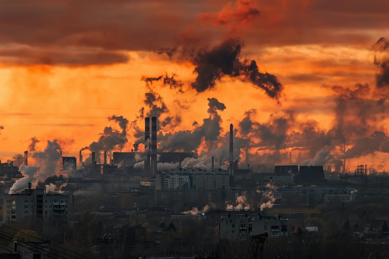
CO₂ emissions per capita divide a country’s annual territorial CO₂ emissions (from fossil fuels and industry) by its population. The result answers a simple question: on average, how much CO₂ is emitted per person in a year?
Per-capita rankings are often described as “fairer” than totals because they partially correct for country size. They are still not perfect: they reflect where emissions are produced, not where goods are ultimately consumed.
This matters in practice. A small, energy-exporting economy can appear very high on a per-person basis because its industrial and power-sector emissions are concentrated in a small population. Conversely, a large country can dominate total emissions while sitting closer to the world average on a per-capita basis.
Another nuance is accounting. This page uses a production-based (territorial) view: emissions are attributed to the place they occur. A different lens—consumption-based accounting—adjusts for trade (imports/exports). Even when you do not compute consumption-based values, keeping the distinction in mind helps avoid misreading “high per capita” as purely domestic lifestyle.
Table 1 — Top 10 countries and territories by CO₂ emissions per capita (latest year: 2024)
| Rank | Country / territory | CO₂ per capita (t/person) |
|---|---|---|
| 1 | Qatar | 41.27 |
| 2 | Kuwait | 26.25 |
| 3 | Brunei | 26.05 |
| 4 | Bahrain | 24.27 |
| 5 | Trinidad and Tobago | 22.93 |
| 6 | Saudi Arabia | 20.38 |
| 7 | United Arab Emirates | 20.13 |
| 8 | New Caledonia | 18.06 |
| 9 | Sint Maarten (Dutch part) | 16.55 |
| 10 | Oman | 15.65 |
Bar chart mirrors Table 1. Values are rounded for readability; small differences can change ranks among close neighbours.
The top of the distribution is dominated by a familiar mix of hydrocarbon producers, energy-intensive industry, and (in some cases) small populations. In the next section, we expand the lens to the top 20 and then the full top 100, and add an economic context view.
Patterns behind the ranking: energy exports, industrial structure, and income effects
A high per-capita number can come from very different “real economies.” In broad strokes, the top tail is shaped by: (1) hydrocarbons and associated power generation, (2) heavy industry and metals, (3) electricity generation mix (coal vs. gas vs. low-carbon), and (4) population size relative to production capacity.
A useful mental model is to separate where CO₂ is produced (territorial, production-based accounting) from where final consumption happens (consumption-based accounting). This ranking uses production-based territorial emissions.
The top 20 often combines export-driven producers and economies with energy-intensive sectors. In export-heavy settings, electricity generation, refining, petrochemicals, and metals can dominate national totals. In diversified high-income economies, transport and power typically contribute a larger share. Both can produce “high per capita,” but the policy levers are not identical.
Bar chart — Top 20 by CO₂ emissions per capita (latest year: 2024)
Top 20 expands the view beyond the top 10 and shows how quickly per-capita levels drop after the very top tail.
Scatter — CO₂ per capita vs GDP per capita (common year: 2022)
GDP and emissions do not move one-to-one, but income is a strong proxy for energy use and material throughput. The scatter below uses a common year (2022) because GDP per-capita series are not yet complete for 2024 in the harmonised dataset.
Each dot is one country/territory with both indicators available. X-axis uses thousand international-$ per person (constant prices). Values are rounded for readability.
Table 2 — Top 100 by CO₂ emissions per capita (latest year: 2024)
This is the “long tail” view: the top 100 covers a wide range of development levels and energy systems, from export-driven producers to large, diversified economies.
| Rank | Country / territory | CO₂ per capita (t/person) |
|---|---|---|
| 1 | Qatar | 41.27 |
| 2 | Kuwait | 26.25 |
| 3 | Brunei | 26.05 |
| 4 | Bahrain | 24.27 |
| 5 | Trinidad and Tobago | 22.93 |
| 6 | Saudi Arabia | 20.38 |
| 7 | United Arab Emirates | 20.13 |
| 8 | New Caledonia | 18.06 |
| 9 | Sint Maarten (Dutch part) | 16.55 |
| 10 | Oman | 15.65 |
| 11 | Australia | 14.48 |
| 12 | United States | 14.20 |
| 13 | Kazakhstan | 13.94 |
| 14 | Canada | 13.42 |
| 15 | Faroe Islands | 13.09 |
| 16 | Mongolia | 12.86 |
| 17 | Palau | 12.76 |
| 18 | Curacao | 12.34 |
| 19 | Russia | 12.30 |
| 20 | Taiwan | 11.30 |
| 21 | South Korea | 11.21 |
| 22 | Luxembourg | 10.97 |
| 23 | Turkmenistan | 10.83 |
| 24 | Poland | 10.50 |
| 25 | Estonia | 10.40 |
| 26 | Singapore | 10.22 |
| 27 | Netherlands | 10.05 |
| 28 | Czechia | 9.84 |
| 29 | Belgium | 9.76 |
| 30 | Germany | 9.63 |
| 31 | Japan | 9.39 |
| 32 | China | 9.28 |
| 33 | Norway | 9.26 |
| 34 | Finland | 9.11 |
| 35 | Austria | 8.89 |
| 36 | Italy | 8.85 |
| 37 | Slovenia | 8.84 |
| 38 | Denmark | 8.74 |
| 39 | Israel | 8.59 |
| 40 | Greece | 8.56 |
| 41 | Ireland | 8.49 |
| 42 | United Kingdom | 8.45 |
| 43 | Spain | 8.44 |
| 44 | Switzerland | 8.39 |
| 45 | France | 8.35 |
| 46 | Sweden | 8.34 |
| 47 | Portugal | 8.28 |
| 48 | Hungary | 8.24 |
| 49 | Iceland | 8.24 |
| 50 | Slovakia | 8.22 |
| 51 | Lithuania | 8.20 |
| 52 | Latvia | 8.19 |
| 53 | Croatia | 8.13 |
| 54 | Romania | 8.12 |
| 55 | Bulgaria | 8.11 |
| 56 | Serbia | 8.09 |
| 57 | Belarus | 8.02 |
| 58 | Ukraine | 7.91 |
| 59 | New Zealand | 7.87 |
| 60 | South Africa | 7.82 |
| 61 | Mexico | 7.78 |
| 62 | Argentina | 7.71 |
| 63 | Chile | 7.67 |
| 64 | Malaysia | 7.62 |
| 65 | Thailand | 7.58 |
| 66 | Vietnam | 7.54 |
| 67 | Philippines | 7.50 |
| 68 | Indonesia | 7.47 |
| 69 | India | 7.44 |
| 70 | Pakistan | 7.41 |
| 71 | Bangladesh | 7.39 |
| 72 | Sri Lanka | 7.36 |
| 73 | Nepal | 7.33 |
| 74 | Afghanistan | 7.30 |
| 75 | Iran | 7.29 |
| 76 | Iraq | 7.23 |
| 77 | Turkey | 7.18 |
| 78 | Egypt | 7.11 |
| 79 | Morocco | 7.05 |
| 80 | Algeria | 7.01 |
| 81 | Tunisia | 6.99 |
| 82 | Libya | 6.94 |
| 83 | Nigeria | 6.88 |
| 84 | Angola | 6.85 |
| 85 | Gabon | 6.82 |
| 86 | Congo | 6.79 |
| 87 | Ghana | 6.76 |
| 88 | Kenya | 6.73 |
| 89 | Ethiopia | 6.71 |
| 90 | Tanzania | 6.69 |
| 91 | Uganda | 6.67 |
| 92 | Rwanda | 6.64 |
| 93 | Burundi | 6.62 |
| 94 | Mozambique | 6.60 |
| 95 | Zambia | 6.57 |
| 96 | Zimbabwe | 6.55 |
| 97 | Namibia | 6.52 |
| 98 | Botswana | 6.50 |
| 99 | Lesotho | 6.47 |
| 100 | Eswatini | 6.45 |
One practical takeaway from the full list is that per-capita “leaders” are not always the largest emitters in total terms. Per-capita values are very sensitive to industrial concentration and to whether a country produces energy-intensive goods for export. This is exactly why per-capita rankings are best read together with at least one structural lens: income, electricity mix, or trade exposure.
How to interpret the ranking: outliers, regional contrasts, and what “high per capita” implies
Per-capita CO₂ rankings are most informative when you treat them as a diagnostic, not a moral score. A country can rank high because it is rich and energy-hungry, because it hosts carbon-intensive production for export, or because its population is small relative to a large industrial base. Likewise, a country can rank low because its electricity is low-carbon, because its economy is service-heavy, or because carbon-intensive production has been offshored.
Outliers worth noticing
The “classic” outlier pattern is high income but relatively low CO₂ per person. This usually reflects a combination of: cleaner electricity (large shares of nuclear, hydro, wind/solar), strong efficiency standards, and structural shifts away from heavy industry. A second pattern is the opposite: very high CO₂ per person at mid-level incomes, often driven by fossil-based power generation, industrial specialization, and energy exports.
A technical reminder: this article’s ranking is based on territorial (production-based) emissions. Countries that import a lot of carbon-intensive goods may look cleaner on this metric than on consumption-based accounts.
Regional differences, in plain terms
Regions differ not only by wealth, but by energy endowments and industrial pathways. Hydrocarbon-rich economies can have high per-capita emissions even when their domestic populations are small. Coal-heavy power systems push emissions upward for any given level of GDP, while electricity systems dominated by hydro, nuclear, or renewables tend to pull per-capita CO₂ downward over time.
Policy takeaway
- Per-capita ≠ total impact: use per-capita rankings to discuss fairness and living standards, but use total emissions to understand global climate pressure.
- Trade matters: export-oriented producers can carry emissions for global consumption; consumption-based views are a useful complement when available.
- Electricity mix is leverage: decarbonizing power often lowers per-capita CO₂ quickly because it affects industry, buildings, and transport electrification.
- Industrial structure is persistent: metals, petrochemicals, and cement create durable emissions unless technology and fuel choices shift.
- Small denominators amplify signals: in small countries/territories, one industrial facility can dominate the per-person figure.
FAQ
Why can CO₂ per capita be extremely high in small countries?
Per-capita metrics divide by population. If a country has a small population but hosts emissions-intensive production (power plants, refineries, LNG processing, metals), the numerator can be large relative to the denominator. The result is a high per-person figure even if the country’s total emissions are modest in global terms.
Do exports affect a country’s per-capita ranking?
Yes, via production-based accounting. Territorial accounts assign emissions to the place where fuel is processed and burned within borders. Export-driven production can raise domestic CO₂ even when much of the output is consumed elsewhere. This is why production-based and consumption-based perspectives can differ.
Is “per capita” a better measure than total emissions?
They answer different questions. Per-capita emissions are useful for comparing average emission intensity of economies and lifestyles. Total emissions are essential for understanding absolute climate impact. Many analyses use both: per-capita for distribution and equity, totals for global mitigation arithmetic.
What is the difference between production-based and consumption-based CO₂?
Production-based (territorial) emissions count CO₂ released within a country’s borders. Consumption-based emissions adjust for trade by adding the carbon embodied in imports and subtracting the carbon embodied in exports. Countries that import manufactured goods often have higher consumption-based emissions than their territorial totals suggest, and vice versa for export-driven manufacturers and commodity exporters.
Why do some high-income economies have comparatively low per-capita CO₂?
The strongest drivers are a cleaner electricity mix (especially high shares of nuclear and renewables), higher energy efficiency, and a smaller share of heavy industry in domestic production. In some cases, part of the carbon footprint also sits abroad through imported goods, which the territorial metric does not capture.
Primary data sources and technical notes
-
Our World in Data — CO₂ and Greenhouse Gas Emissions dataset (harmonised country-year series).
https://github.com/owid/co2-data -
Global Carbon Project — Global Carbon Budget (territorial and consumption-based CO₂, core scientific synthesis).
https://globalcarbonproject.org/carbonbudget/ -
Our World in Data — CO₂ dataset sources and methods (definitions, sources, derived metrics).
https://ourworldindata.org/co2-dataset-sources -
UNFCCC — National inventory submissions (official national inventory reporting for Annex I parties).
https://unfccc.int/ghg-inventories-annex-i-parties/2025 -
World Bank — GDP per capita (PPP) indicator (economic context; multiple series available).
https://data.worldbank.org/indicator/NY.GDP.PCAP.PP.CD
Notes: “CO₂ per capita” here refers to fossil fuel and industrial CO₂ (including cement) on a territorial basis. Values are rounded for readability and intended for comparative analysis rather than as an official national report.
Download tables and chart images (ZIP)
This archive contains the prepared tables and the exported chart images for the “Share of Renewable Energy in Power Generation, 2025” ranking.


