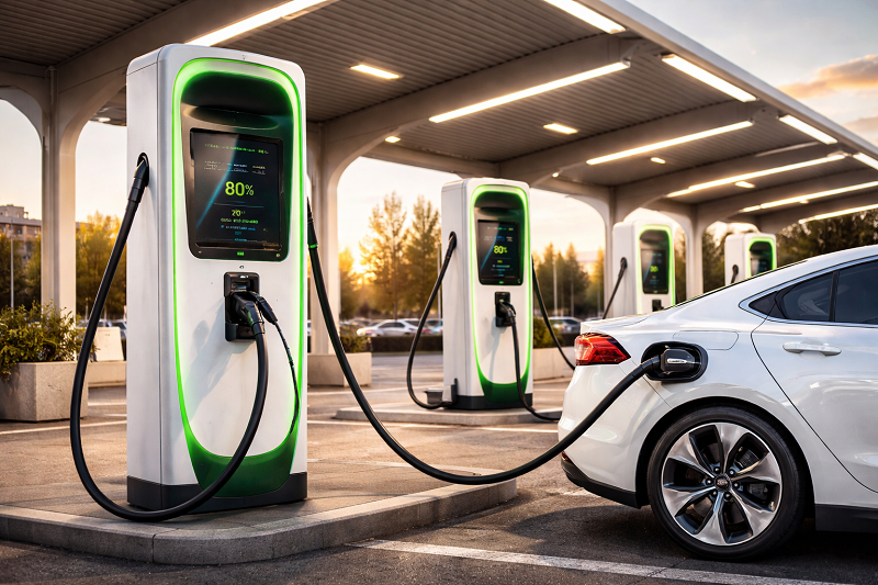
100 Countries by Public EV Chargers per 100,000 People, 2025
Public EV Chargers per 100,000 People (2025): Top-100 Density Ranking
Metric: public EV charging points per 100,000 people Year: 2025. The per-capita denominator makes cross-country comparison intuitive: it approximates how “visible and reachable” public charging is for residents. It can still diverge from on-the-ground experience when chargers are concentrated in capital areas, when corridors serve heavy transit, or when uptime is weak.
The top of the ranking usually reflects long-run deployment capacity: permitting speed, grid connection workflows, and predictable investment conditions. Countries with consistent rollouts tend to show a “coverage effect”: once a dense baseline exists, additional sites are deployed into gaps rather than only into profitable hotspots, which improves accessibility for apartment dwellers and for drivers without home charging.
This page focuses on density. For adoption context, compare with EV share in new car sales (2025), plus background mobility indicators such as passenger car ownership (2025) and traffic congestion (2025).
| Rank | Country | Public chargers per 100k (2025) |
|---|
Note: a dense network can still underdeliver if equipment is unreliable or if fast charging is scarce on intercity routes. The next part adds regional medians and a readiness comparison against EV market adoption.
Explanation & Links: Regional Medians and Infrastructure Readiness
Two countries can have similar EV adoption and still diverge on public charging density because the supply chain is not just hardware. The binding constraints are often grid connection lead times, site availability, and operational reliability. High-density leaders typically resolve these constraints with standardized permitting, predictable interconnection processes, and repeated rollouts (many small sites rather than a few headline projects).
Per-capita density is most informative when interpreted as a “coverage signal.” It reflects how likely a driver is to encounter a charger in normal travel. It does not guarantee an absence of queues, because queuing depends on peak demand, charging speed mix, and station uptime. That is why readiness is assessed here with a second axis: EV share in new car sales.
Methodology (micro-block)
Public chargers are charging points accessible to the public (networks and public-access locations). The indicator normalizes the count by population and reports chargers per 100,000 people for 2025. Cross-country comparisons can differ when inventories count connectors vs points, or when “public access” definitions vary. Subnational concentration (capital-centric deployment) can also cause a country to feel undersupplied despite a moderate national density.
| Region | Median chargers per 100k (2025) | Share of countries above median |
|---|---|---|
| Europe | Varies by subregion; typically higher than global median | Around half (by definition), with wide spread between leaders and late adopters |
| North America | Moderate density with strong metro clustering | Around half, with uneven corridor coverage |
| Asia | Broad range from highly built-out hubs to low-density markets | Around half, with strong concentration in top markets |
| Oceania | Mid-range density with focus on urban access and highway nodes | Around half, with small sample size |
| Latin America | Early-stage rollouts, mainly in capitals and key corridors | Around half, with low absolute levels |
| Africa | Very low density in most markets | Around half, but concentrated among a few leaders |
The readiness scatter below usually produces three interpretive zones. Ahead indicates charging density that is high relative to current adoption, often associated with early buildout, tourism/transit demand, or strong municipal deployment. Balanced indicates infrastructure scaling alongside adoption. Behind indicates adoption pressure rising faster than public access, which can translate into localized queues, reliance on home charging, or charging deserts.
A high X-value can be driven by small-country scaling, dense urban form, or corridor provisioning. A high Y-value can rise faster than public access when home charging dominates early, but public networks become more critical as apartment living, fleets, and intercity travel expand.
Interpretation, Policy Takeaways, and Sources
Public charging density is a structural mobility indicator. It tends to improve the feasibility of EV ownership for residents without private parking, supports ride-hailing and light commercial fleets, and reduces the perceived risk of longer trips. However, density alone does not capture service quality. Reliability, power levels, and payment interoperability determine whether a “large number” of chargers behaves like real capacity during peak hours.
Economically, higher charging availability can lower non-price barriers to electrification and can shift investment from a niche early-adopter market to a broader consumer base. In markets where adoption accelerates quickly, the most visible constraint is often not the total count but the distribution: chargers in the right places, with sufficient power, and with predictable uptime. That is why corridor fast-charging, urban access for apartment districts, and maintenance practices matter as much as headline deployment.
The readiness comparison against EV share in new car sales is best read as a pressure gauge. When adoption rises faster than public access, localized shortages become more likely, especially in dense housing areas and during holiday traffic. When public access rises faster than adoption, the system may appear “overbuilt,” but that can also reflect planning for future growth, tourism/transit needs, or a policy preference for universal accessibility.
Policy takeaway
- Make reliability measurable: uptime targets, outage reporting, and maintenance SLAs raise effective capacity without adding hardware.
- Prioritize urban access: dense AC coverage in apartment-heavy districts improves equity of access and reduces dependence on home charging.
- Close corridor DC gaps: intercity fast-charging reduces peak-season queues and improves national travel feasibility.
- Coordinate grid upgrades: focus on substations/feeders serving high-utilization sites to avoid chronic throttling.
- Track two denominators: per 100k people for accessibility and per 1,000 EVs for demand pressure.
FAQ
What qualifies as a “public” EV charger in international comparisons?
Public chargers are typically defined as charging points accessible to the public, including public networks and public-access sites. Differences arise when inventories count connectors vs charging points, or when access rules differ by operator and country.
Why can a country rank high per capita but still feel inconvenient for drivers?
National density can mask capital-centric placement, low uptime, or a shortage of fast chargers on corridors. Concentration in a few areas may leave large regions underserved even with a strong national per-capita score.
Which is more informative: chargers per 100k people or chargers per 1,000 EVs?
Chargers per 100k people is an accessibility lens: how visible public charging is for residents. Chargers per 1,000 EVs is a pressure lens: how tight supply may be relative to the EV fleet. During rapid adoption, both are useful because they can move in opposite directions.
Why does the AC vs DC mix matter for “readiness”?
AC supports long dwell times (shopping, work, overnight public-access settings). DC supports intercity travel and time-sensitive use cases. A high total count dominated by AC can still leave corridor travel constrained if DC coverage is thin.
How should the scatter chart be interpreted?
Points with high charging density and high EV share indicate mature ecosystems. High density with lower EV share can indicate early buildout, small-country scaling, or tourism/transit provisioning. Lower density with higher EV share indicates potential near-term pressure in public access.
What are common reasons cross-country figures do not match local operator dashboards?
Reporting cutoffs differ, some datasets aggregate by operator while others use registries, and definitions vary (connectors vs points, public access rules, inclusion of semi-public sites). These differences can shift rankings even when the direction of change is consistent.
Primary data sources and technical notes
International Energy Agency (IEA) — Global EV Outlook (charging chapter) Context on global charging growth, public charging deployment patterns, and market concentration dynamics. https://www.iea.org/reports/global-ev-outlook-2025/electric-vehicle-charging European Alternative Fuels Observatory (EAFO) — infrastructure indicators EU-focused infrastructure tracking and cross-country comparability references for charging deployment. https://alternative-fuels-observatory.ec.europa.eu/ UK Department for Transport — EV public charging statistics (method example) Official example of per-population reporting, definitions, and statistical methodology for public devices. https://www.gov.uk/government/collections/electric-vehicle-charging-statistics Open Charge Map — open infrastructure directory (coverage reference) Open directory often used for completeness checks; definitions may differ from official registries. https://openchargemap.org/ StatRanker — EV share in new car sales (2025) Internal adoption context used for readiness interpretation and cross-page linking. https://statranker.org/mobility/top-100-countries-by-electric-vehicle-share-in-new-car-sales-2025/Dataset note: the page is designed to render a full Top-100 table and a Top-20 bar chart from the same list. Updating the Top-100 values in Part 1 automatically refreshes the table and chart.
One archive with the tables (CSV/XLSX) and chart images used on this page.
⬇ Download ZIP


