

TOP 10 Countries by Mortality Attributable to Air Pollution (PM2.5) per 100,000 People (2025)
What “PM2.5-attributable mortality” means
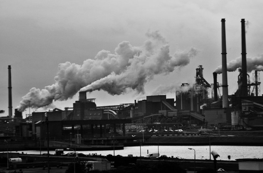
PM2.5 is fine particulate matter with an aerodynamic diameter of 2.5 micrometres or less. Because these particles can reach deep into the lungs and enter the bloodstream, long-term exposure is linked to higher risks of ischaemic heart disease, stroke, chronic obstructive pulmonary disease (COPD), lung cancer and lower respiratory infections. In global comparative risk assessments, a share of deaths from these causes is attributed to PM2.5 exposure above a minimum-risk baseline.
Global context: the State of Global Air 2024 reports that air pollution contributed to 8.1 million deaths globally in 2021. In high-burden settings, PM2.5 is typically the dominant pollutant driving the health toll (through both household smoke and ambient particulate pollution).
Top 10 countries by pollution-attributable mortality rate (per 100,000)
The ranking below uses the GAHP “Pollution and Health Metrics” report (published 2019, using the latest GBD data available for that release) for the highest per-capita death rates. GAHP’s list is for overall pollution (air, water, lead, occupational), but GAHP notes that air pollution (ambient + indoor) corresponds closely to the top per-capita burden in these countries. In practice, that makes this Top 10 a useful PM2.5-heavy proxy for where air-pollution mortality is most intense.
| Rank | Country | Deaths per 100,000 | Notes (why high) |
|---|---|---|---|
| 1 | Chad | 287 | High exposure + vulnerability (household fuels, dust, weak care) |
| 2 | Central African Republic | 251 | High household + ambient burden, limited mitigation capacity |
| 3 | North Korea | 202 | Industrial/urban emissions + household exposure |
| 4 | Niger | 192 | Dust + solid fuels + health system constraints |
| 5 | Madagascar | 183 | Biomass use, chronic exposure, limited protective infrastructure |
| 6 | Papua New Guinea | 183 | Household smoke plus environmental exposure drivers |
| 7 | South Sudan | 180 | Fragility amplifies health risks and reduces resilience |
| 8 | Somalia | 179 | Multiple pollution pathways, limited controls |
| 9 | Serbia | 175 | Ambient PM episodes + chronic exposure burden |
| 10 | India | 174 | High exposure in many regions + large baseline cardiometabolic burden |
Chart: Top 10 death rates per 100,000 (GAHP)
- Chad287
- Central African Republic251
- North Korea202
- Niger192
- Madagascar183
- Papua New Guinea183
- South Sudan180
- Somalia179
- Serbia175
- India174
Methodology (how the “2025” snapshot is built)
Primary ranking source (per-capita): the Top 10 values use GAHP’s Pollution and Health Metrics report (published December 2019). This report compiles pollution-attributable deaths per 100,000 people (country level) using the latest Global Burden of Disease inputs available for that release and produces a transparent, reproducible Top-10 list for “highest rates of death attributed to pollution”.
Why this works as a PM2.5 proxy: GAHP notes that air pollution (ambient + indoor) corresponds closely to the highest-rate countries and is a dominant component of the pollution burden in many settings. For reader interpretation and cross-country comparability, the official UN/WHO-aligned metric is SDG 3.9.1: the age-standardised mortality rate attributed to household and ambient air pollution (per 100,000).
Limits to keep in mind: these are modelled estimates with uncertainty; “pollution deaths per 100,000” is not identical to the SDG 3.9.1 age-standardised air-pollution rate; and country monitoring gaps can widen uncertainty, especially in fragile states. The purpose here is an evidence-based “where the burden is most intense” snapshot, not a definitive clinical count.
Why death rates are so extreme in the highest-burden countries
- Household smoke: reliance on solid fuels (wood/charcoal/crop residues/kerosene) can push indoor PM2.5 far above health guidelines, with spillover into ambient air.
- Ambient sources: traffic, small industries, generators, open burning, brick kilns and weak emission enforcement sustain chronic exposure.
- Vulnerability: higher baseline cardiometabolic and respiratory risk, plus weaker access to prevention and treatment, increases deaths per unit of exposure.
- Natural and climatic factors: dust events and seasonal burning can prolong high-PM episodes.
Insights for 2025 readers
- Per-capita burden clusters in fragile systems: the highest rates concentrate where household fuels, uncontrolled emissions and constrained healthcare overlap.
- Air pollution is a health-system multiplier: the same exposure is deadlier when hypertension, diabetes and COPD are under-diagnosed and under-treated.
- Big countries can dominate totals without topping per-capita lists: populous countries may contribute the largest number of deaths, while smaller states top the “per 100k” ranking.
What this means for the reader
- Risk is partly personal: indoor cooking smoke, commuting corridors, and winter inversions can meaningfully change exposure.
- Local policy matters: clean household energy, transport standards and industrial controls tend to show up quickly in health gains.
- Use rates, not headlines: “deaths per 100,000” helps compare places on intensity; totals reflect population size.
FAQ
Is this ranking strictly “PM2.5 deaths”?
The Top-10 numbers are GAHP “deaths attributed to pollution per 100,000” (air, water, lead, occupational). GAHP reports that air pollution corresponds closely to the high-rate list. PM2.5 is typically the dominant air-pollution component driving health impacts in high-burden settings, so this ranking is best read as a PM2.5-heavy proxy.
Why do low-income countries dominate the Top 10?
Exposure is often higher (solid fuels, uncontrolled emissions, dust) and the health system “buffer” is smaller (less prevention and treatment for cardiovascular and respiratory diseases). That combination increases deaths per unit of pollution.
Why is India in the Top 10 even though it has strong growth and modern sectors?
Per-capita mortality reflects the mix of exposure (including household fuels in many regions, plus ambient PM in major cities) and vulnerability. India also appears across multiple GAHP lists because it combines high intensity in parts of the country with a very large population.
How should I compare countries fairly?
For cross-country comparability, use the SDG 3.9.1 age-standardised indicator (household + ambient air pollution per 100,000). Age standardisation helps remove the effect of older vs younger populations. This article’s Top-10 ranking is a clear per-capita snapshot; it should be complemented with the official SDG series for detailed comparisons.
Do wildfires change the ranking?
Severe wildfire years can spike PM2.5 exposure and short-term risk, but rankings based on multi-year modelled burden usually reflect chronic exposure patterns. Robust analysis should look at trends rather than a single year.
What is the fastest policy lever to reduce PM2.5 deaths?
In high-burden settings, scaling clean household energy (reducing indoor smoke) can deliver rapid health gains, especially for women and children. Transport and industrial controls can also reduce ambient PM quickly when enforced.
What should StatRanker update next?
Replace the proxy ranking with the latest WHO SDG 3.9.1 country series (age-standardised) as new vintages are released, and add uncertainty ranges where available.
Data notes (what the official metric is)
For cross-country comparisons, the closest “official” mortality indicator aligned with global methods is SDG 3.9.1: the age-standardised mortality rate attributed to household and ambient air pollution (per 100,000). WHO describes this as a comparative risk-assessment estimate based on PM2.5 exposure and cause-specific risk functions.
The Top-10 list in Part 1 is GAHP’s transparent per-capita “pollution deaths per 100,000” snapshot (published 2019). Treat it as an evidence-based “where the burden is most intense” proxy and pair it with the SDG series when you need age-standardised comparisons.
Quick calculator: what a “per 100,000” rate means in people
A rate is easier to compare; a count is easier to imagine. Use the calculator below to convert an annual rate (per 100,000) into an approximate number of deaths for a given population size.
Worked examples
| Population | Rate (per 100,000) | Estimated annual deaths | How to read it |
|---|---|---|---|
| 10,000,000 | 180 | ≈ 18,000 | About 180 deaths per 100,000 implies ~0.18% of the population per year. |
| 5,000,000 | 250 | ≈ 12,500 | High “per-capita” burden can be fewer deaths in total if the population is small. |
| 50,000,000 | 80 | ≈ 40,000 | Lower rate can still translate into a large total count in big populations. |
Progress signal (children under 5): an index view
The State of Global Air 2024 highlights that the disease burden linked to air pollution in children under 5 has decreased by about 35% since 2010, largely driven by reductions related to household air pollution. The index chart below visualises that single, policy-relevant signal without overloading the page with raw series.
How to use this ranking responsibly
- Rates vs totals: per-capita rates show intensity; total deaths scale with population size.
- Age structure matters: older populations tend to have higher baseline cardiovascular risk. Prefer age-standardised series (SDG 3.9.1) when comparing countries.
- Model uncertainty: countries with limited monitoring and weaker vital registration may have wider uncertainty ranges.
- Air pollution is multi-source: household smoke, traffic, industry, dust and open burning can all contribute; the best interventions depend on the dominant source profile.
Interpretation: what the Top 10 is really telling you
The striking part of the Top 10 is not just “dirty air” — it is the combination of exposure and vulnerability. In the highest-burden countries, pollution sources (household smoke, uncontrolled combustion, dust episodes, open burning) intersect with limited prevention and treatment for cardiovascular and respiratory disease. The result is a high number of deaths per 100,000 people even when populations are relatively small.
A second insight is how rankings depend on the metric. A per-capita list highlights intensity. A “total deaths” list is dominated by large populations. For policy and accountability, you typically need both: intensity (rates) to see where the risk is most concentrated, and totals to understand global burden and resource needs.
Policy takeaways (what tends to work in practice)
- Clean household energy first: shifting cooking and heating away from solid fuels can rapidly reduce exposure for women and children and often improves ambient air as well.
- Transport standards and fuel quality: inspection regimes, low-sulphur fuels and particulate controls reduce urban PM2.5 quickly when enforcement is consistent.
- Industrial permitting and end-of-pipe controls: targeted controls for power plants, brick kilns, and small industry can deliver large local PM reductions.
- Open burning and dust management: bans with enforcement, alternatives for waste handling, road paving and construction-site standards can cut coarse and fine particles.
- Health-system adaptation: better diagnosis and treatment of hypertension, diabetes, and COPD reduces deaths per unit exposure (pollution becomes less lethal).
- Measurement and transparency: expanding monitoring and vital registration narrows uncertainty and supports better targeting and evaluation.
Common pitfalls when reading pollution mortality rankings
- Mixing indicators: GAHP “pollution deaths per 100,000” is not identical to WHO SDG 3.9.1 (age-standardised air-pollution mortality). Use each for what it is best at.
- Assuming exact precision: modelled estimates have uncertainty intervals, especially where monitoring is sparse.
- Over-attributing to one source: PM2.5 is often dominant, but the source mix (household, traffic, industry, dust, burning) differs by country and season.
- Single-year fixation: unusual years (wildfire seasons, dust extremes) can move short-term risk; trend context matters.
Sources (official and primary)
- GAHP / Pure Earth — Pollution and Health Metrics (Dec 2019, PDF) Provides the Top-10 “highest rates of death attributed to pollution” per 100,000 (Chad 287, CAR 251, … India 174) and explains the construction of per-capita death-rate rankings.
- World Health Organization (WHO) — SDG 3.9.1 indicator metadata Definition and method notes for the age-standardised mortality rate attributed to household and ambient air pollution (per 100,000), including cause set and comparative risk-assessment approach.
- Health Effects Institute (HEI) — State of Global Air 2024 announcement Key headline findings including the global burden of air pollution deaths in 2021 and the positioning of air pollution among leading risk factors.
- State of Global Air — 2024 news release Summary of SoGA 2024 findings, including deaths in 2021 and child health highlights. Useful for reader-friendly context around the formal datasets.
- Our World in Data — Outdoor air pollution (GBD-based series) Downloadable time series and visualisations (GBD-derived) for PM2.5 exposure and death rates, convenient for building trend charts and comparisons.
Download: PM2.5 mortality (proxy) — tables & chart images
ZIP archive with the Top 10 table, worked examples, chart datasets (JSON), and PNG images used in the visuals.
- tables/ — Top 10 table (CSV) and worked examples (CSV)
- html/ — the same tables as plain HTML fragments
- data/ — chart-ready datasets (JSON)
- charts/ — exported chart images (PNG)


