Countries by Currency Depreciation vs USD (YoY) — 2025/2026 snapshot
Weakest Currencies Against the U.S. Dollar: Biggest Year-over-Year Falls
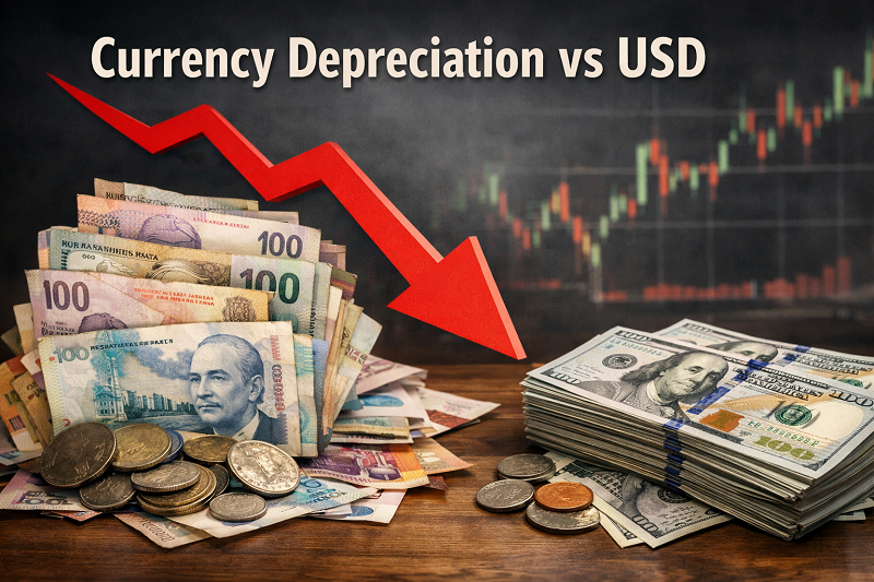
Sudan, Venezuela and South Sudan recorded the steepest year-over-year collapses against the U.S. dollar in the latest February 2026 end-of-period snapshot. The upper end of this ranking is dominated by currencies under extreme pressure from inflation, shortage of hard currency, official devaluations or abrupt exchange-rate regime shifts.
Thank you for reading this post, don't forget to subscribe!This page is for readers looking for the worst performing currencies in 2026, the weakest currencies against USD or the countries where depreciation has been most severe over the last year. The ranking below shows where the sharpest losses happened, how broad the gap is between the worst cases and the rest of the field, and which currencies look like one-off devaluations versus longer multi-year slides.
How this depreciation ranking works
The headline metric is year-over-year depreciation versus the U.S. dollar using an end-of-period snapshot. In plain terms, it compares where the currency stood in February 2026 with where it stood in February 2025. A negative reading means the local currency lost value against USD.
Some values can look unusually large because this is a level-to-level exchange-rate move, not a consumer price index and not a bounded percentage scale. When a currency goes through a sharp devaluation, a parallel-market reset, or a jump from one exchange-rate regime to another, the year-over-year change can exceed 100% in local-currency-per-dollar terms. That does not mean the currency went below zero. It means the number of local currency units needed to buy one U.S. dollar rose dramatically.
EoP is useful because it captures where the currency actually ended up in the latest snapshot. It can, however, look more extreme than an annual average-rate method when the biggest move happened late in the period.
Top 10 highlights (EoP YoY, Feb 2025 → Feb 2026)
Sudan stands apart even within this list. The scale of the move points to deep currency dislocation rather than an ordinary cyclical weakening.
Venezuela remains a classic case of chronic currency erosion reinforced by extreme inflation and repeated policy distortions.
South Sudan shows how quickly pressure can build when inflation, external fragility and managed-rate stress collide.
Lebanon is the clearest example in this group of a multi-year currency collapse rather than a single bad year.
The Top 10 is not just a list of weak currencies. It is a list of economies where exchange-rate stress has been severe enough to reshape import costs, debt servicing pressure and real household purchasing power.
Chart: Top 20 YoY depreciation vs USD (Feb 2025 → Feb 2026)
Chart preview (Top 10 list). If the chart does not load, the data is still available here:
- Sudan (SDG): −165.0%
- Venezuela (VES): −88.4%
- South Sudan (SSP): −54.2%
- Lebanon (LBP): −49.8%
- Nigeria (NGN): −44.5%
- Turkey (TRY): −38.2%
- Argentina (ARS): −32.0%
- Ethiopia (ETB): −29.5%
- Egypt (EGP): −25.1%
- Iran (IRR): −22.5%
How to read the ranking
- YoY depreciation shows where the currency ended up after one year, not the average path through the year.
- 3-year change helps separate a fresh devaluation from a longer structural collapse.
- High inflation + depreciation usually means stronger pressure on import prices, savings and foreign-currency obligations.
- A weaker currency can improve export competitiveness in some cases, but at the household level it often means a faster rise in the local cost of fuel, medicine, equipment and other imported goods.
Top 25 : sortable + filters, no horizontal scrolling
This section uses the same EoP slice as Part 1 and focuses on the Top 25 where the dataset provides the full set of fields. Period: YoY = Feb 2025 → Feb 2026, 3-year ≈ Feb 2023 → Feb 2026. Sorting and filters are applied consistently across all three tables below.
Sorting rules: depreciation and 3-year change are ordered from the most negative value (worst) upward. Inflation is ordered from highest to lowest.
Table A: Core ranking
| Rank | Country | Currency | YoY depreciation vs USD |
|---|---|---|---|
| 1 | Sudan | SDG | −165.0% |
| 2 | Venezuela | VES | −88.4% |
| 3 | South Sudan | SSP | −54.2% |
| 4 | Lebanon | LBP | −49.8% |
| 5 | Nigeria | NGN | −44.5% |
| 6 | Turkey | TRY | −38.2% |
| 7 | Argentina | ARS | −32.0% |
| 8 | Ethiopia | ETB | −29.5% |
| 9 | Egypt | EGP | −25.1% |
| 10 | Iran | IRR | −22.5% |
| 11 | Pakistan | PKR | −18.9% |
| 12 | Ghana | GHS | −16.4% |
| 13 | Zimbabwe | ZiG | −14.8% |
| 14 | Brazil | BRL | −12.2% |
| 15 | South Africa | ZAR | −11.4% |
| 16 | Kazakhstan | KZT | −10.5% |
| 17 | Russia | RUB | −9.8% |
| 18 | Colombia | COP | −9.2% |
| 19 | Uzbekistan | UZS | −8.4% |
| 20 | Japan | JPY | −7.9% |
| 21 | Mexico | MXN | −7.2% |
| 22 | Kenya | KES | −6.5% |
| 23 | Indonesia | IDR | −5.8% |
| 24 | Vietnam | VND | −4.2% |
| 25 | China | CNY | −3.5% |
Table B: Macro context
| Rank | Country | 3-year change vs USD | Inflation YoY |
|---|---|---|---|
| 1 | Sudan | −425.0% | 192.5% |
| 2 | Venezuela | −995.0% | 682.0% |
| 3 | South Sudan | −110.5% | 97.5% |
| 4 | Lebanon | −4,500.0% | 25.0% |
| 5 | Nigeria | −235.0% | 31.5% |
| 6 | Turkey | −205.0% | 34.7% |
| 7 | Argentina | −920.0% | 150.0% |
| 8 | Ethiopia | −92.0% | 22.4% |
| 9 | Egypt | −124.0% | 19.8% |
| 10 | Iran | −152.0% | 38.0% |
| 11 | Pakistan | −75.0% | 14.5% |
| 12 | Ghana | −68.2% | 12.2% |
| 13 | Zimbabwe | — | 89.0% |
| 14 | Brazil | −28.5% | 5.3% |
| 15 | South Africa | −35.0% | 4.8% |
| 16 | Kazakhstan | −21.4% | 9.4% |
| 17 | Russia | −52.0% | 8.2% |
| 18 | Colombia | −14.0% | 5.8% |
| 19 | Uzbekistan | −28.0% | 8.1% |
| 20 | Japan | −18.2% | 2.1% |
| 21 | Mexico | −8.5% | 4.4% |
| 22 | Kenya | −45.0% | 6.8% |
| 23 | Indonesia | −11.0% | 3.5% |
| 24 | Vietnam | −9.5% | 3.8% |
| 25 | China | −12.4% | 0.4% |
Table C: FX regime + region
| Rank | Country | FX regime | Region |
|---|---|---|---|
| 1 | Sudan | Float | Africa |
| 2 | Venezuela | Other | Americas |
| 3 | South Sudan | Managed | Africa |
| 4 | Lebanon | Peg | MENA |
| 5 | Nigeria | Float | Africa |
| 6 | Turkey | Managed | Europe |
| 7 | Argentina | Peg | Americas |
| 8 | Ethiopia | Managed | Africa |
| 9 | Egypt | Float | MENA |
| 10 | Iran | Other | MENA |
| 11 | Pakistan | Managed | Asia |
| 12 | Ghana | Float | Africa |
| 13 | Zimbabwe | Managed | Africa |
| 14 | Brazil | Float | Americas |
| 15 | South Africa | Float | Africa |
| 16 | Kazakhstan | Managed | Asia |
| 17 | Russia | Managed | Europe |
| 18 | Colombia | Float | Americas |
| 19 | Uzbekistan | Managed | Asia |
| 20 | Japan | Float | Asia |
| 21 | Mexico | Float | Americas |
| 22 | Kenya | Managed | Africa |
| 23 | Indonesia | Float | Asia |
| 24 | Vietnam | Managed | Asia |
| 25 | China | Managed | Asia |
Scatter: YoY depreciation vs inflation (Feb 2025 → Feb 2026)
This chart highlights “double pressure” cases: a currency weakening vs USD while inflation is elevated. Points without an inflation value are excluded.
Chart preview. If the scatter does not load, the highest-pressure examples (YoY, Inflation) include:
- Venezuela: −88.4%, 682.0%
- Sudan: −165.0%, 192.5%
- Argentina: −32.0%, 150.0%
- South Sudan: −54.2%, 97.5%
- Zimbabwe: −14.8%, 89.0%
- Turkey: −38.2%, 34.7%
- Nigeria: −44.5%, 31.5%
- Iran: −22.5%, 38.0%
- Lebanon: −49.8%, 25.0%
- Egypt: −25.1%, 19.8%
Interpretation: why currencies end up in the “worst performers” list
Big YoY depreciation events usually cluster around a small number of macro mechanisms. The ranking itself is not a “forecast” — it is a rear-view snapshot of where the exchange rate ended up over the last year (EoP, Feb 2025 → Feb 2026).
Reading rule: A one-year drop is not always a persistent trend. A devaluation, unification of exchange rates, or a late-year policy shift can compress large moves into a short window. Use 3-year change plus the FX regime to distinguish one-off adjustments from multi-year erosion.
1) Inflation differential (domestic prices outrun anchors)
When domestic inflation runs persistently above trading partners, the currency often weakens over time to “re-price” local costs. In the extreme, this can become a feedback loop: depreciation raises import prices, which raises inflation, which then pressures the currency again.
- What to look for: high inflation alongside negative YoY depreciation (the “double pressure” quadrant in the scatter).
- Typical channels: monetized deficits, weak credibility of the policy framework, rapid credit growth.
2) External financing gap (current account + debt rollover)
Currencies often weaken when an economy needs foreign currency but has limited inflows: current-account deficits, large FX debt service, or thin reserves. The pressure rises when global rates stay high or risk appetite turns defensive.
- What to look for: large import bills, declining reserves, rising spreads, persistent parallel-market premiums.
- Typical channels: FX scarcity, forced devaluations, tighter controls, delayed import payments.
3) FX regime and controls (float vs managed vs peg)
The exchange-rate regime shapes how pressure is absorbed. Under a float, pressure often appears as continuous moves. Under a managed system, pressure may be “smoothed” until a discrete adjustment becomes unavoidable.
- Floats can show frequent moves but also faster price discovery.
- Managed regimes may accumulate pressure via reserves or restrictions.
- Pegs can look stable for long periods, then re-price sharply once the peg is adjusted or abandoned.
Why a “peg” can look stable… until it suddenly isn’t
A peg can mask underlying pressure because the quoted rate is policy-administered. If reserves are used to defend the peg, the exchange rate can appear stable while imbalances build elsewhere: arrears, import restrictions, multiple exchange rates, or widening gaps vs parallel markets. When an adjustment happens, the move can be abrupt — which is why peg systems sometimes show step changes rather than smooth depreciation.
What depreciation means for prices and purchasing power
- Imported goods typically get more expensive in local currency (fuel, medicine, machinery, food imports).
- Inflation pass-through tends to be higher when imports are a big share of consumption or production inputs.
- Wages often adjust with a lag, so real purchasing power can drop even if nominal wages rise.
What it means for debt, savings, and balance sheets
- FX-linked debt becomes harder to service (for governments, firms, and households with USD liabilities).
- Savers may shift into hard-currency assets where allowed, increasing dollarization pressure.
- Banking risk rises if borrowers earn in local currency but owe in USD.
What it can mean for exporters and tourism
- A weaker currency can improve export competitiveness in local-currency terms.
- Tourism often becomes cheaper for USD holders, which can boost inflows.
- But gains can be limited if exports rely on imported inputs or if controls disrupt trade finance.
Policy takeaways (what tends to stabilize)
- Credible disinflation (fiscal + monetary alignment) is the most durable stabilizer over time.
- Reserve buffers help smooth shocks, but they are not a substitute for fundamentals.
- Transparent FX frameworks reduce premiums and fragmentation (multiple rates, ad-hoc restrictions).
- Debt management matters: reducing near-term FX rollover pressure can lower depreciation risk.
Method note: EoP vs average-rate (why the choice matters)
This article uses end-of-period (EoP) to match a “latest snapshot” use case (where the market ended up in Feb 2026). An average-rate method can be preferable for some macro comparisons because it smooths volatility and aligns better with annual flow variables. For transparency, the period is labeled consistently throughout: YoY = Feb 2025 → Feb 2026.
Sources (datasets and references)
Primary series and supporting references used to compile the snapshot and classify regimes/contexts:
- IMF — Representative Exchange Rates (Feb 2026 snapshot)
- Federal Reserve — annual currency references (major U.S. trading partners)
- Trading Economics — market monitoring (spot series / updates)
- Visual Capitalist / Voronoi — “Performance of World Currencies 2025” (compiled dataset)
- RBC Capital Markets — Currency Report Card 2026 (volatility & EM commentary)
FAQ: Currency Depreciation vs USD (YoY)
These answers refer to the same snapshot used in Parts 1–3: end-of-period (EoP) with the latest refresh dated Feb 2026, where YoY = Feb 2025 → Feb 2026.
1 What does “depreciation vs USD (YoY)” mean? ▾
It is the percentage change in the exchange-rate level versus the U.S. dollar over one year. In this dataset, the comparison is end-of-period (EoP): the level in Feb 2026 vs the level in Feb 2025.
A value of −20% means the currency’s value fell by about 20% against USD over that period.
2 Why are the values negative? ▾
Negative values are used here to make the sign intuitive: negative = weaker vs USD, positive = stronger vs USD. This is a ranking of “worst performers,” so the most negative values appear at the top.
3 Why do some countries show extreme drops? ▾
Very large depreciations usually reflect a mix of factors that can coincide:
- High inflation and weak policy credibility (price levels running far ahead of trading partners).
- FX scarcity (low reserves, import constraints, difficult debt rollover).
- Regime shifts (rate unification, devaluations, or changes in controls that move the official rate closer to market clearing).
In these cases, a one-year window can capture a large adjustment that built up over multiple years.
4 What’s the difference between EoP and average-rate methods? ▾
EoP (end-of-period) compares the rate at the end of the period to the rate one year earlier. It is a “where it ended up” snapshot and can look sharper in years with late moves.
Average-rate uses the mean exchange rate across the year. It smooths volatility and can align better with annual flow variables (trade, tourism revenue, annual GDP conversions), but it can understate late-year shocks.
5 Can a currency weaken even if inflation is not very high? ▾
Yes. A currency can weaken for reasons that are not primarily domestic inflation, such as:
- Risk-off cycles and global rate differentials (capital moving toward higher-yield or “safe” assets).
- Terms-of-trade shifts (commodity prices, export volumes) that change FX inflows.
- Policy signaling (expected easing or interventions) affecting positioning and hedging demand.
That’s why the scatter chart is helpful: it separates “double pressure” (high inflation + depreciation) from primarily financial-cycle moves.
6 Why can a peg look stable and then drop sharply? ▾
Under a peg or a tightly managed system, the quoted rate can stay stable while pressure accumulates elsewhere (reserves falling, restrictions increasing, parallel-market spreads widening, payment arrears growing).
When the peg is adjusted or abandoned, the exchange rate may “catch up” in a short time — producing an abrupt move rather than a smooth trend.
7 How should travelers and businesses use this ranking? ▾
Use it as a risk and context tool, not as a one-click forecast:
- Travelers: large depreciation can make destinations cheaper in USD terms, but price volatility and access to FX can matter more than the headline number.
- Importers: depreciation typically raises local costs for inputs and inventory; FX hedging and pricing clauses become more important.
- Borrowers with USD debt: depreciation increases debt service in local currency and can stress balance sheets.
- Exporters: competitiveness may improve, but benefits can be limited if production relies on imported inputs or if trade finance is constrained.
StatRanker (Website)
administrator