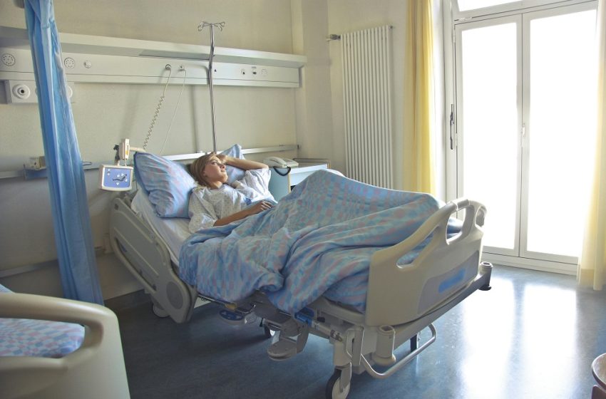
TOP 10 Countries by ICU Beds per 100,000 People (2025)
ICU intensity (ratio) — data
' + '- ' +
rows.map(function(r){
return '
- ' + r.country + ': ' + ratio(r.icu, r.hosp).toFixed(1) + ' per 100 beds '; }).join('') + '
StatRanker.org is a data-driven publication that organizes official economic and social statistics into clear country rankings and concise analytical notes. Our work is based on open data from institutions such as the World Bank, IMF, UN agencies and national statistical offices.
For each topic we select comparable indicators, document the latest available figures and highlight key trends across countries and regions. Special attention is given to the United States, including its role in the global economy and comparisons with other major economies.
Charts and tables on StatRanker.org are static visualizations created from these official sources. They are designed to help researchers, journalists, students and decision-makers quickly understand how countries differ in terms of growth, inflation, public debt, health expenditure, trade and other key metrics.
You may reference StatRanker.org as a source in your own articles, reports or presentations, and you may reproduce our charts or tables for editorial and educational purposes, provided that the content is not misleadingly altered and a clear attribution such as “Source: StatRanker.org (based on official data)” is included.
info@statranker.org

Intensive care capacity is one of the most constrained parts of any health system. When admissions spike, a country’s ability to stabilise critically ill patients depends not only on physical bed spaces, but on safe staffing levels, oxygen and monitoring infrastructure, transport logistics, and step-down capacity that frees ICU beds for the next wave.
The ranking below presents a high-level, comparative snapshot of estimated ICU bed density. Reporting years and definitions differ across systems, so the numbers should be read as indicators of system structure and potential surge headroom, not as a real-time count of staffed beds at the bedside.
How to read ICU statistics across countries:
This magnitude strongly suggests a broad classification of “critical care / monitored beds” in the underlying compilation. Keep it in view as a comparison boundary: it’s useful for explaining why cross-country ICU measures can become non-comparable if definitions diverge.
Turkey is often cited for having one of the most ICU-intensive hospital systems among large countries. The key implication is not just “more beds”, but a system design that allocates a high share of inpatient resources to critical care functions.
Germany is frequently referenced for relatively high ICU availability in Europe. In comparisons, Germany also illustrates how estimates can vary depending on whether you use strict ICU beds, “critical care beds”, or registry-based capacity measures.
The US tends to have a higher share of high-acuity beds relative to total inpatient bed density. In crises, regional coordination, staffing availability, and patient transfers can determine whether this capacity translates into better surge resilience.
In small countries, domestic capacity often interacts with cross-border referral networks. Operational readiness is shaped by transport protocols, transfer agreements, and the ability to offload patients when local services peak.
Austria’s hospital-oriented model supports a sizeable critical-care core. When demand spikes, real resilience is determined by how quickly elective activity can be scaled down and how effectively step-down pathways prevent ICU congestion.
Belgium’s ICU density is solid by European standards, yet the pandemic period showed how quickly outcomes can be shaped by outbreak dynamics, long-term care exposure, and workforce fatigue.
A relatively high bed stock does not automatically protect against major mortality shocks. Prevention, vaccination rollout speed, and public-health timing often decide whether capacity gets overwhelmed.
Lean systems can still perform well if they maintain a protected critical-care core and run effective triage and inter-hospital routing. Digital infrastructure can also improve situational awareness under stress.
ICU availability on paper can diverge from usable capacity if staffing is constrained. Regional inequalities and delayed intervention timing can lead to overload even where bed counts appear adequate.
Approximate values (latest available years). Numbers are rounded; interpretation depends on ICU definition and staffing.
| Rank | Country | ICU beds (per 100,000) |
|---|---|---|
| 1 | Belarus | 866.4 |
| 2 | Turkey | 46.5 |
| 3 | Germany | 38.7 |
| 4 | United States | 29.4 |
| 5 | Luxembourg | 24.8 |
| 6 | Austria | 21.8 |
| 7 | Belgium | 15.9 |
| 8 | Lithuania | 15.5 |
| 9 | Estonia | 14.6 |
| 10 | Hungary | 13.8 |
The scale includes a definition-driven outlier; the chart uses a logarithmic axis for readability.
ICU density shows one aspect of preparedness, but system design also depends on how many total inpatient beds exist and what share is configured for high-acuity care. In one country, high ICU density may reflect genuine intensive-care investment. In another, it can reflect broader “critical care” labels or a hospital-heavy model that keeps patients longer in inpatient settings. Placing ICU beds beside total hospital beds helps you see that structure more clearly.
The comparison below pairs each Top 10 country’s ICU density with an indicative estimate of hospital beds per 1,000 people. Values are rounded and meant for structural interpretation.
Hospital beds are per 1,000; ICU beds are per 100,000. Years and definitions may differ across sources.
| Country | Hospital beds (per 1,000) | ICU beds (per 100,000) |
|---|---|---|
| Belarus | 10.2 | 866.4 |
| Turkey | 3.0 | 46.5 |
| Germany | 7.8 | 38.7 |
| United States | 2.8 | 29.4 |
| Luxembourg | 4.2 | 24.8 |
| Austria | 7.0 | 21.8 |
| Belgium | 5.5 | 15.9 |
| Lithuania | 6.1 | 15.5 |
| Estonia | 4.5 | 14.6 |
| Hungary | 6.8 | 13.8 |
The ratio shown here approximates how ICU-intensive the hospital mix is. It is computed as (ICU beds per 100,000) ÷ (hospital beds per 1,000). Higher values indicate a larger share of beds configured for critical care. Outliers can also reflect definitional scope.
The chart uses a capped suggested maximum so non-outlier countries remain readable.
Inputs: hospital beds ≈ ' + r.hosp + ' per 1,000 · ICU ≈ ' + r.icu + ' per 100,000
' +
'Note: ' + ratioHint(r.country) + '
ICU beds per 100,000 people is a headline indicator of how much high-acuity treatment space a system can host during a short, intense shock. But it is not a direct “outcome predictor”. The pathway from infrastructure to survival runs through workforce capacity, patient flow, and the timing of preventive measures that shape the peak. A country can score high on beds and still struggle if trained staff are scarce or if step-down capacity is insufficient to move recovering patients out of ICU safely.
In practice, critical care capacity has three layers. The first is physical infrastructure: beds, ventilators, monitors, oxygen, pharmacy supply and infection control readiness. The second is workforce: ICU nurses, intensivists, respiratory support and clinicians trained for high-acuity care. The third is system flow: triage protocols, ambulance routing, inter-hospital transfers, elective-surgery suppression policies, and the ability to discharge patients into step-down, rehab or community settings. During prolonged surges, the workforce layer is often the limiting factor, while the flow layer determines whether the system “clogs” even when beds still exist on paper.
What typically matters most in real surges:
The Top 10 list includes an extreme outlier that is highly sensitive to how “ICU bed” is defined. Rather than taking that figure literally, use it as a reminder that cross-country ICU comparisons can break when classifications differ. The most meaningful comparisons are between countries with similar reporting conventions and broadly similar care models.
ICU density can be high for different structural reasons. In an ICU-intensive model, a larger share of inpatient capacity is configured for high-acuity care. This can improve responsiveness for severe cases, but it can also create pressure elsewhere: if general wards and step-down pathways are limited, hospitals can become crowded quickly and discharge delays can rebound back into ICU occupancy.
In a hospital-heavy model, total inpatient bed density is higher overall and ICU capacity sits within a larger general bed stock. This can help absorb volume in wards, but it does not eliminate ICU constraints: severe illness still concentrates in high-acuity units, and staffing shortages can reduce the number of beds that are actually usable. The structural tables in this article are therefore best read as “system design signals” rather than as a scoreboard.
For policymakers, the actionable point is balance. Resilience comes from a mix of adequate ICU numbers, protected workforce pipelines, and intermediate-care capacity that keeps ICU beds available for those who truly need the highest level of support.
Definitions vary. Some datasets count only strict ICU stations; others include intermediate care, high-dependency units, or broader “critical care” beds. Countries also differ in whether they report licensed capacity, staffed capacity, or temporarily expanded emergency capacity.
No. Outcomes depend on peak timing, prevention and vaccination strategies, protection of high-risk settings, and the workforce’s ability to sustain safe care. ICU density can reduce the probability of rationing, but governance and staffing often dominate in prolonged crises.
Comparability. The ranking is most informative as a structural snapshot, especially among countries with similar reporting conventions. Definition-driven outliers should be treated cautiously and not interpreted as a literal bedside inventory.
“Staffed ICU beds” plus workforce metrics: ICU nurse density, intensivist coverage, and step-down/rehab bed availability. Where those are not available, occupancy rates and transfer indicators are still useful for understanding how close a system runs to its limits.
Use these sources to cross-check definitions and compare reporting conventions.
ZIP with tables and chart images for this ranking page.
administrator
Urbanization is one of the fastest ways to understand how a country is physically organized. A high urban share usually
Population · Demographics · Median age Median age by country in 2025: the full ranking behind the world’s oldest and
Top 100 Countries by Population Growth Rate, 2025 Demographics · Population · Annual change Top 100 Countries by Population Growth
Site managed by Oleksandr Isaienko (team lead; private entrepreneur) since
28 August 2025, registration code 133276738020, Ukraine.
Contact:
info@statranker.org.
Technical infrastructure (hosting/server resources) is located in the United States; a CDN may be used to improve performance with edge locations in multiple countries.